PhotoShelter for Photographers Blog
-

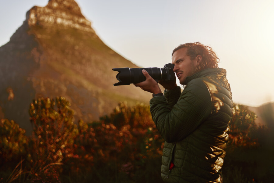
Expert Advice and Top Tips from Pro Photographers for 2024
What’s one piece of advice you would give to aspiring or up-and-coming photographers? We asked nine experienced photographers and PhotoShelter members to share their top tips for those looking to get ahead in their photography careers. From finding your own visual voice to working with a mentor or photo assistant, each piece of advice listed […]
-

What’s On Your Photography Holiday Wish List?
The holiday season is around the corner and that means it’s the perfect opportunity to upgrade your gear or find that special gift for the visual storyteller or photography enthusiast in your life. We reached out to a handful of renowned photographers and PhotoShelter members, each with their unique styles and preferences, to bring you […]
-

Share a Photo That Means the World to You
We all have a photo that means the world to us. Maybe it’s one we made ourselves – the first photo from our first camera. It could be an old family photo in a beloved photo album. Or maybe it’s an iconic image that hangs on our wall at home. With World Photography Day coming […]
-
PhotoShelter Product Updates: A Note from Andrew Fingerman
Today I’m very excited to share some eagerly-awaited updates on PhotoShelter for Photographers. It’s been a while since we last connected about new product efforts – here at PhotoShelter we’ve been working on several projects that deliver a new user experience, more capabilities and improvements on key features, and we’re pushing forward on new ways […]
-

National Photography Month: The Power of Visual Storytelling
Photography is our favorite form of storytelling. Behind every photo is a lasting memory, a moment frozen in time. No matter the genre or speciality, there’s always something to learn from photography, too. It’s a universal language, yet everyone has the opportunity to walk away with something unique – whether it’s a lesson learned, a […]
-

Thank You, Photographers: Why We Love National Photography Month
National Photography Month is a time to honor the incredible photographers who make a remarkable impact on our world, one stunning image at a time.
-
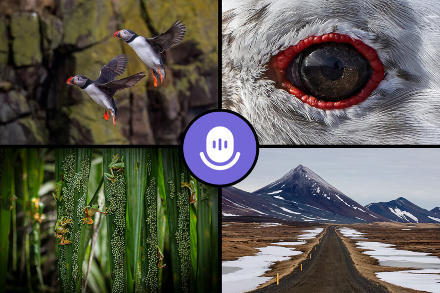
Celebrating Earth Day Everyday: A Twitter Space Show and Tell with Wildlife and Landscape Photographers
Social media is a great way for photographers to connect with other creatives from all walks of life. You can easily share stories, support each other, and learn from one another, no matter where you are in the world, or the stage of your personal or professional journey. We love bringing photographers together and hearing […]
-
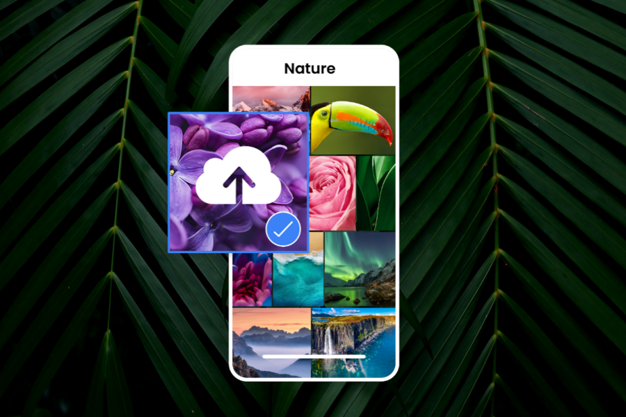
PhotoShelter’s FileFlow App: Now with Upload for iOS!
With FileFlow upload, it’s easier than ever to add images to your PhotoShelter archive from your iOS mobile device. Just tap the upload icon and choose your files. It’s simple, intuitive, and keeps your workflow flowing.
-
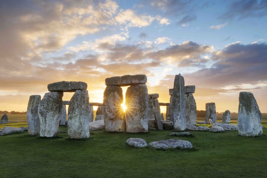
Seeing Stonehenge: On Assignment for Discover Britain Magazine with Jeremy Flint
Uncovering the unknown and revisiting history are two great reasons why photography is so special. When it comes to significant landmarks around the world, we might see thousands of photos of these relics over the course of our lifetime. But the story behind these sites and the individual perspectives behind these photos are truly unique. […]