Share
Travel Photography for Stock – A Primer
Travel represents one of the most popular content submission areas for the PhotoShelter Collection, and as such, we are becoming increasingly more ...
Travel represents one of the most popular content submission areas for
the PhotoShelter Collection, and as such, we are becoming increasingly
more selective about the types of images that we accept. The following
guidelines are prescriptive for travel photography, although some
concepts will extend into the general realm of stock photography.
The
guidelines are the same guidelines presented to our photo editors
dealing with travel photography. The editors are accorded the latitude
to make subjective calls, and therefore, these guidelines are
structured so you understand situations where the probability of
rejection is higher. We believe this is a more sensible methodology
rather than having a blanket enforcement of a rule which is probably
not applicable to all images. For example, if you submit a low contrast
photo with a blown-out sky of the Afghan Buddhas before they were
destroyed by the Taliban, we are very likely to accept it. However, if
the structures were still standing, we have a higher probability of
rejecting the image. Context, historical importance, and even quality
of the caption affect the probability of acceptance.
Travel
imagery probably has a rejection rate somewhere in the 40-50% range.
This is a reflection of 1) the large amounts of travel photography, 2)
the fact that many non-pros shoot and submit travel content, 3)
self-editing of travel imagery isn’t as stringent as it is in other
categories (i.e. a photographer submits many images of the same subject
from multiple angles).
What does salable travel imagery look like?
We
suggest checking out the following magazines to acquaint you with the
style and technical level of photography that is being used
commercially today:
– Travel + Leisure
– Conde Nast Traveler
– National Geographic Traveler
Whitney
Lawson from Travel + Leisure told us, “We are looking for a filmy look
with natural light – nothing that looks [overly] digital, or like PR
[press relations material]…”
Remember to shoot a variety of
vantage points. No one wants to see just a picture of an entire
building. Get some detail. Get some mid-range images. Get some
interiors. Create an overall sense of a place. Most importantly, take
the time to see what images are being published, and then use a
critical eye against your own work. The devil is often in the details,
and developing your skills to scrutinize an image will make you a
better photographer.
Content Saturation
Certain
locations and landmarks are more heavily photographed than others. One
way to tell whether an area is saturated or not, is to search the PSC
yourself. If an area is saturated, we are more likely to apply a higher
level of scrutiny to the image before allowing it. For example, we have
many images of London, but not many of Mauna Kea, therefore, we are
more likely to accept “average” images of the latter, while being
highly selective of London images.
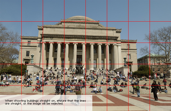
Point of View/Focus
A
travel photo must convey enough information to the viewer to give them
context of where they are and what they are looking at. If you shoot
Big Ben, make sure Big Ben is in focus/exposed, and not the sculpture
you’re shooting through. Similarly, there are cliché shots (e.g. a
narrow street, cars on the street) in travel that are submitted in
large numbers to the PSC. Make sure these types of shots have no
technical defects whatsoever in order to avoid a higher probability of
rejection.
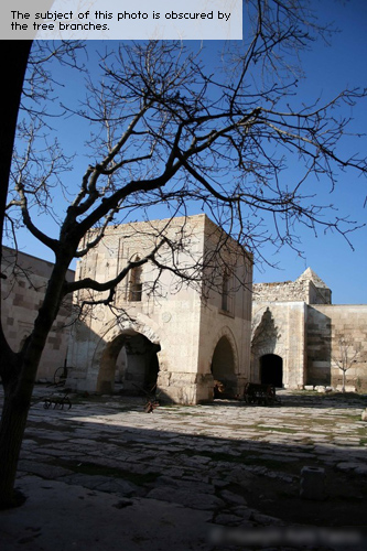
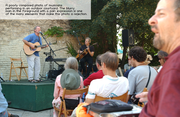
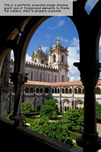
The subject of your photo should also be clear in
focus and exposed. We’ve seen some photos where the the subject is
out-of-focus and a foreground element is more prominent. Similarly,
framing a photo with a tree or other fauna is ok if the tree isn’t
obscuring the subject, and you don’t have a bright distracting object
(e.g. a flower) in the foreground. These types of gaffes will increase
the probability of rejection.
Rejected
photos often have many characteristics that push it over the threshold
of rejection. Creating a great photo requires a lot of thought,
planning, and practice!
“Evergreen” areas
Some
destinations never seem to grow old, and picture buyers are constantly
seeking images of these destinations. These areas include:
- Caribbean
- Hawaii
- Europe
- Italy
- France
- Germany (Berlin is hot now)
- Mexico (specifically the Mayan Riviera)
- American
cities (particularly in light of the weak dollar – Boston, New York,
Washington, DC, Dallas, Las Vegas, San Francisco, Seattle) - “Driving Story” destinations (e.g. Napa Valley, National Parks)
Still,
even with these areas, the goal should still be to make an iconic
picture; one that both is beautiful, but also contains enough
contextual elements to avoid being perceived as “this could be
anywhere.”
Vintage Images
Images of places shot long
ago (e.g. pre-digital) are of interest because of their relative
scarcity, and if they convey a sense of a specific time and place, they
have a higher probability of being accepted even if there are some
technical defects. This does not mean you should start scanning all
your old slides. Please still apply scrutiny to your own edit.
TECHNICAL (in no particular order):
Indoor/Low light
Low light situations create challenges for the photographer. These include:
- Motion blur and camera shake result from slow shutter speeds.
- Most people cannot consistently hand hold at speeds of 1/30s or longer
- Motion blur resulting from a moving subject can occur at 1/60s (people walking) all the way up to 1/1000s (hands of professional athletes)
- Visible noise or poor dynamic range when the light is too low in many cameras except the newest high end DSLRS. Most digital cameras perform poorly over ISO 400.
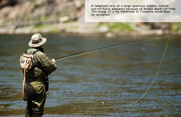
- Shallow depth-of-field (and usually out of focus elements that are important) resulting from opening the aperture completely

We see these types of problems when people are shooting inside of cathedrals or other religious buildings and with dusk/nighttime photography.
Images like these have a very high probability of being rejected. We recommend using a tripod in these situations or avoiding them altogether if your camera does not perform well under these conditions.
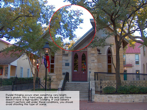
Purple Fringe
A purple halo appearing near bright edges of your image indicates that you’re pushing the performance limits of your camera. Typically, your lens doesn’t have a high-quality coating, or you might have an older sensor. Images displaying a purple fringe have a very high probability of rejection.
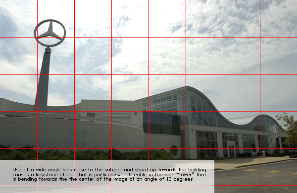
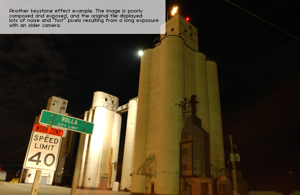
Keystone Effect
When the film plane or digital sensor isn’t parallel to the subject you are shooting, a keystone effect is created whereby the top of the object looks as if it is falling away or receding from the camera. The effect is pronounced with wide angle lenses, and has a tendency to make images look “amateur” (because top architectural photographers correct for this effect by using tilt-shift lenses or view cameras). Images exhibiting the keystone effect have a higher probability of being rejected.
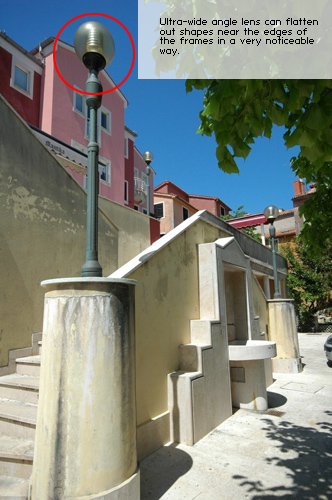
Ultra-wide lenses
Advances in lens design have allowed consumers to acquire ultra-wide angle lenses with minimal vignetting and optical problems. As such, the use of ultra-wide lenses (e.g. 10mm – 24mm) have become trendy. Ultra-wide lenses can cause massive distortion of closer objects, bend parallel lines, and in many cases are not additive to the image. Photographers are more likely to go ultra-wide than backing up a few feet. Images where the intent of the ultra-wide angle doesn’t feel deliberate have a higher probability of being rejected.
Quirky Angles & Non-level horizons
This type of composition is problematic in that it’s highly subjective as to whether the angle makes a better photo. Abstract composition for travel images need to contain enough contextual information to be recognizable.
Although some of these images are very successful, they generally have a higher probability of being rejected.
Poorly composed people, posed images, images of tourists,
People who appear in travel photos should be local to the environment and not obviously tourists. Camera bags, bucket hats and sunglasses are dead giveaways. Images that feature people who seem to be tourists will have a high rate of rejection. Travel journalism, in part, cultivates a fantasy around the destination for the traveler. No one dreams about being surrounded by a tour group even if that ends up being the reality of their trip.
When local people are photographed, all the rules of composition, getting intimate with your subject, and capturing the correct moment still apply. Posed portraits of ethnic peoples around the world are very likely to be rejected. Generally a cleaner setting that is unpopulated is preferable for images of specific landmarks.
Blown-out skies and detail
Many travel images are scenes that depict large areas, and therefore are subject to a wide range of exposures. Shooting in the middle of the day, in particular, creates pockets of heavy shadow as well as very bright areas.
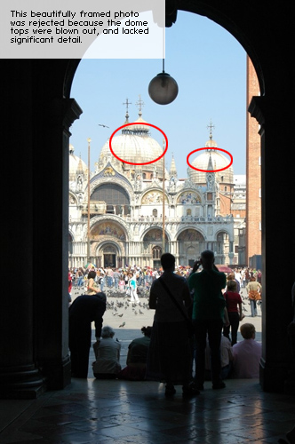
We will generally summarily reject content where there are exposure issues, even when the subject is exposed properly but the background is not (A bright window in an otherwise dark room would be one exception). The prime example is blown out skies. The way to avoid this is to either wait for exposure of the sky to equalize with the exposure of the subject, use a polarizing or neutral density filter, or use post-production techniques to dodge the sky and retain detail (assuming you didn’t lose all of it in the first place).
Black and White vs. Color
If you shot an image in color (i.e. digitally), you should strongly consider submitting the color image as opposed to converting to black and white. Color images have a much wider appeal, particularly as stock. You should also only submit one version of an image (color or b/w). In cases where both are submitted, the black and white image will be rejected.
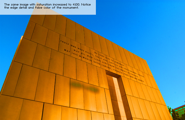
Color Saturation
Heavy saturation can make colors hyper-real. The taste for varying saturation levels is also very cyclical, therefore, images with “normal” saturation levels have a higher probability of being accepted. Clear indicators of too much saturation would be colors that are very vivid in shadow areas.
Contrast
Contrast is a measure of the difference between the lightest and darkest portions of the image. A lot of factors can play into the contrast of an image but suffice it to say that travel images should be fairly straightforward in that the blacks should truly be black, and the whites should be white. You can use Photoshop curves to affect the contrast range of an image.
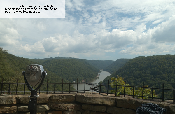
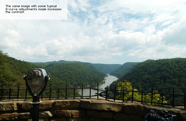
Low contrast images have a higher probability of being rejected. You can avoid these situations by not shooting into the sun. Similarly, images with harsh contrast are also not desirable, this can be avoided by not shooting at the brightest times of the day when the sun is high.
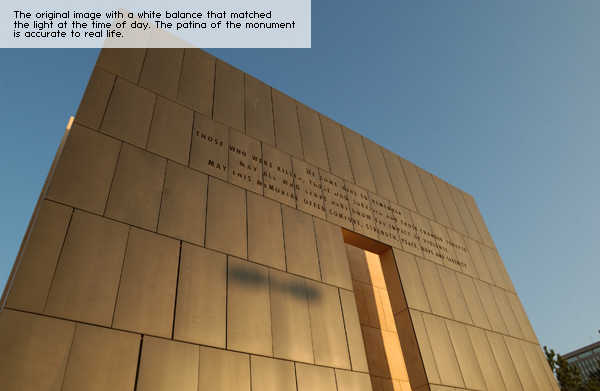
White Balance
Light comes in many different temperatures. The evening sun is very orange, the light beneath a shady tree tends to be a bit bluish. Digital cameras have white balance controls that can create a hue shift that is unnatural. In general, the goal of travel photography should be to present a location as it appears in real life (or slightly better), therefore, white balance should be calibrated to the real color temperature of the light.
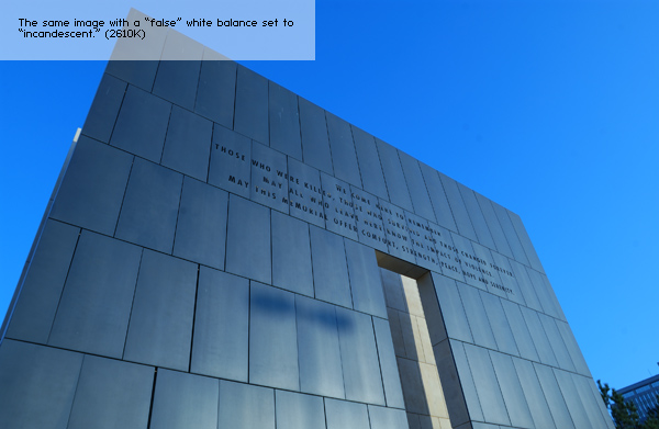
This means that if you’re shooting in the middle of the day, and you set your white balance to “shade”, the sky will appear very dull and have an orange tint to it. Travel images like this have a higher probability of being rejected.
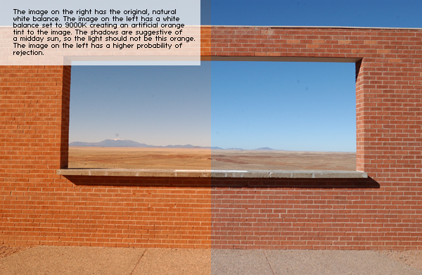
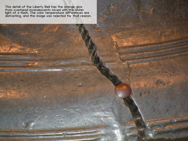
Similarly, shifting the white balance to tungsten/incandescent to create a very blue sky is generally frowned upon, although this is also a matter of subjectivity that we leave up to the editors. Typically, white balance shifts work better near sunset or at night rather than in the middle of the day, where they noticeably and unnaturally shift the colors of the foreground subjects.
Images with mixed lighting sources have a higher probability of rejection. “Neutral” white balances have a better probability of acceptance.
Filtering – optical
The use of UV blocking filters or polarizing filters is perfectly acceptable. Graduated filters (e.g. neutral density, sepia, etc) are more gimmicky and therefore have a higher probability of being rejected.
Filtering – digital
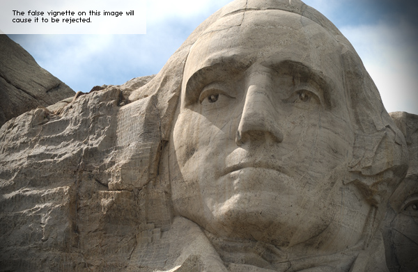
False Vignette
Darkened corners are often added as a stylistic device, however, we will generally reject false vignettes for travel imagery. The composition of the frame should suffice to frame the subject rather than drawing an artificial focus through the application of a false vignette.
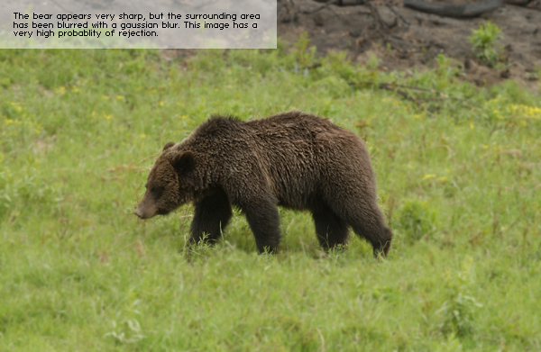
Blur
Like the vignette, blurring is sometime used so that the subject pops from the photo. This should be avoided. Images with artificial blur will be summarily rejected.
Painted Effect
There are a number of preset filters and plug-ins that create a highly stylized, almost painted look to the images. These types of images have a very high probability of rejection.
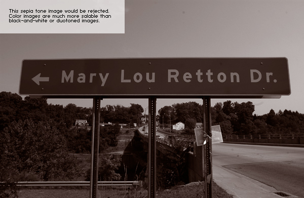
Sepia toning
There are a number of programs with preset sepia toning settings, in general sepia toning is not desirable in travel particularly over color imagery. Toning can be an intrusive element that can drown out the content of your picture. Images with sepia toning applied have a high likelihood to be soft rejected for removal of this effect or rejected outright.
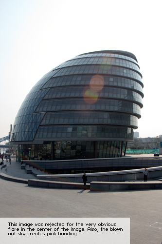
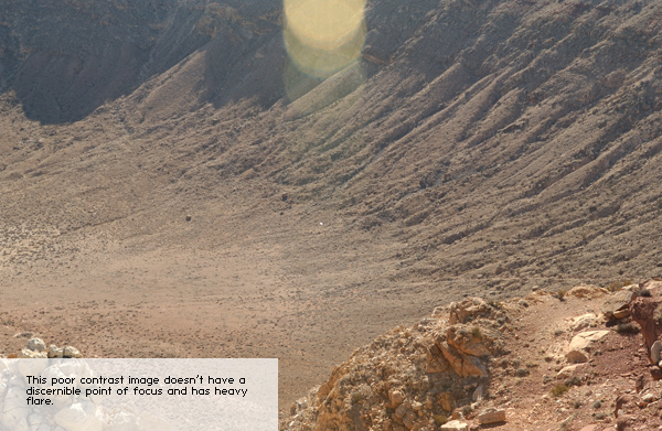
Flare
Camera flare is caused by light that is entering the lens and scatters causing a circular semi-opaque artifact. In some cases, it’s artistic, but in most travel photography it’s distracting. Flare will have a higher probability of rejection.
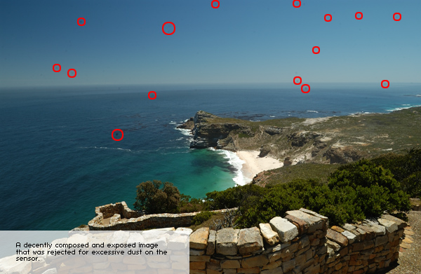
Dust
Digital SLRs are highly prone to dust landing on the sensor and causing black spots particularly in continuous tone areas (e.g. blue skies). You should regularly clean your sensor, or use software to remove them from your images to avoid rejection.
Manipulation (cloning, stamping, removing items)
We generally suggest that you do not manipulate travel imagery, as it alters the factual content. However, there is no industry standard on manipulation for travel imagery, and so we offer the following guidance:
Dust removal, dodging, burning, contrast control
All of these are acceptable forms of manipulation. The key is not to be too heavy-handed with the techniques. For example, the “hand of God” technique which was prevalent in the 70s/80s in newspaper stemmed from the fact that newspaper reproduction is of a much lower quality than magazine and therefore it is necessary to exaggerate the lightening of faces – however in digital or magazine reproduction, it causes a noticeable halo effect around the face. This should be avoided.
Cloning
Cloning is prohibited except where it is used to remove dust from a neutral background. It should not be used to add objects to the scene.
Removal of Objects
Removal of objects like telephone wires, trash, plants should be avoided as it alters the factual content of the image. In cases, where you choose artistically to remove an object, you should disclose the manipulation in the caption.
The Halemaumau crater of Kilauea erupts for the first time in 20 years on the Big Island of Hawai’i. Telephone wires in the foreground were digitally removed.
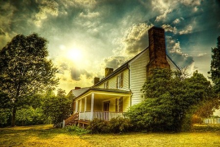
HDR
High dynamic range images have become du jour with the proliferation of RAW and software tools to composite images with multiple exposures to “increase” the range of tones expressed in an image. PhotoShelter will accept HDR images that do not look overly processed (e.g. strange colors, halos, obviously composited), and with HDR appearing in the caption.
An HDR image of Ground Zero near dusk in New York, NY.
Images that look like a photo illustration have a very high probability of rejection like this following image from Smashing Magazine.
Panoramics
Many cameras include software to stitch multiple images together to create a panoramic. PhotoShelter will accept these images as long as they are free of stitching artifacts (e.g. an object appearing twice as a remnant of the stitching process) and the caption should indicate that the image is a panoramic stitch. The panoramic should also be cropped to eliminate any circular edges produced by the stitching software.
A stitched panoramic of Waikiki Beach in Hawai’i.
Congruence of caption and image
Although it’s tempting to batch caption images when you’ve shot many images in a single location, the caption can often not match up with the subject of the image. These images have a very high probability of soft rejection. Captions should be tailored to the exact content of each image.
APPENDIX:
Specific Content Guidance
New and Timely
Newly opened museums, restaurants, airports, and other facilities have the potential to sell well.
Statues
Provide the name, location and artist (if possible) of the statue in the caption. Be mindful of inadvertently cutting off details like feet, hands, etc.
Churches, Cathedrals
Provide the name and location of the structure in the caption. Control the keystone effect. Make sure to not cut off the tops of steeples, spires, etc. Use a tripod indoors (or a very steady hand) to eliminate motion blur.
Restaurants
“Travel is all about service,” says Whitney Lawson. Having images of service-based facilities (restaurants, spas, etc) is all part of the travel photography proposition. But photographing restaurants isn’t just about a picture of the façade, buyers want to see interiors and detail too.
But remember that all the aforementioned rules apply. No one wants bad images.
Planes, Trains, Automobiles
Provide the name and model of the vehicle. Be mindful of inadvertently cutting off fenders, wings, etc from the extremities of the vehicles.
Bad:
An old car in Havana.
Better:
A 1956 Chevy sits outside a café in Downtown Havana.
Mountains, Trees and Nature
Provide the specific name of the vista you’ve shot. General terms like “The Alps” do not provide enough specificity for picture researchers, and have a high probability of being soft rejected.
Bad:
Yosemite National Park
Better:
Half-Dome in Yosemite National Park, CA
Signs
Signs will be accepted if they are well composed, and free from harsh shadows or other obvious technical defects. Signs shot in the middle of the day with heavy shadows on part of the sign will be rejected. Also, If we have saturation of a particular sign, then the probability of rejection is increased.
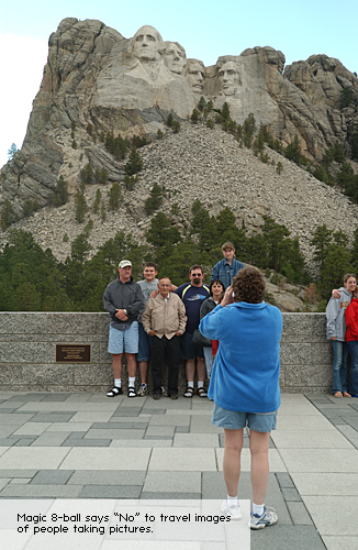
Pictures of people taking pictures
Sometimes these types of images can be quirky, but in many cases, they are just an indication that the destination has too many tourists. Images with people taking pictures have a very high probability of rejection.
Next Post: Snacktime Poll: Spencer Tunick
You May Also Like
-

Expert Advice and Top Tips from Pro Photographers for 2024
What’s one piece of advice you would give to aspiring or up-and-coming photographers? We asked nine experienced photographers and PhotoShelter members to share their top tips for those looking to get ahead in their photography careers. From finding your own visual voice to working with a mentor or photo assistant, each piece of advice listed […]
-

What’s On Your Photography Holiday Wish List?
The holiday season is around the corner and that means it’s the perfect opportunity to upgrade your gear or find that special gift for the visual storyteller or photography enthusiast in your life. We reached out to a handful of renowned photographers and PhotoShelter members, each with their unique styles and preferences, to bring you […]
-

Share a Photo That Means the World to You
We all have a photo that means the world to us. Maybe it’s one we made ourselves – the first photo from our first camera. It could be an old family photo in a beloved photo album. Or maybe it’s an iconic image that hangs on our wall at home. With World Photography Day coming […]