Share
In the (Smokey) Studio with Steve Cohen
So I’ve been talking a lot about fire imagery lately as a trend, and it’s also seeped into my consciousness as something I wanted to work with ...
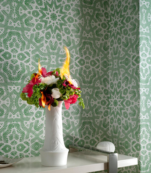

So I’ve been talking a lot about fire imagery lately as a trend, and it’s also seeped into my consciousness as something I wanted to work with in my own photography. In fact, I spent last weekend obsessing about a series of different kinds of flowers on fire, as sort of a still-life study, but also as something beautiful and unexpected. And then Steve Cohen sent me the above image. Now I have to rethink my own project, but not before I purchase a print of that flaming bouquet. Or maybe the glowing book, I can’t decide.
I visited Steve Cohen’s studio a few weeks back, in an attempt to gain a bit more of a foothold on what a still-life photographer’s practice is actually like, and how one gets started doing such precise and painstaking work.
Cohen went to RIT in the ’80s, which was at the time a very commercial program. Had he not become a photographer, he thinks he would have ended up in product design or some sort of engineering. The draw of the blending of science and art has always intrigued him. He told me he’s interested in objects for their volume, shape and texture and how nature informs their design. And indeed, his studio is filled with objects like tree bark and sea sponges that he’s explored photographically. A lot of Cohen’s work comes from entities like Nordstrom’s for whom he shoots handbags and cosmetics, but he approaches every shoot like a story, with a context and subtext.

Cohen was kind enough to answer some of my specific questions about fire, gear, and his recent campaign for Absolut. Here are the answers.
I know you are
very controlled in terms of how you shoot, and that you love the
precision your job brings. Do you think most photo editors and buyers
recognize the nuances of product photography? Who are the folks that
really “get it”? And what does “getting it” entail?
I
do love that aspect of my job, but I think by calling it “product”
photography it does still-life work a disservice. It is technical by
its very nature but it need not be boring or without point of view and
passion. A still life can be any image. Burtynsky’s work is still-life,
so is Crewdson’s in my opinion.

The
best relationships with photo editors, buyers and creative directors
comes from a mutual respect for what we each do best and our
willingness to share our points of view and knowledge with each other.
Language and semantics are very important as well – verbal and visual –
especially when working together for the first time. Often, the
beginning of a working relationship is the beginning of a dialogue.
Over time a shorthand develops as you become familiar. The people that
“get it” are those that speak the language and are enlivened by that
dialogue. There is also much to be said for having a sense of humor and
an inquisitive nature.
Who are other
photographers you’re influenced by? Is anyone in the product photography
field really innovating things right now (everyone’s talking about those sunglasses dripping
in honey)…
photographers you’re influenced by? Is anyone in the product photography
field really innovating things right now (everyone’s talking about those sunglasses dripping
in honey)…
Flavor
of the month will always be just that – creative evolution is more of a
challenge I think. The thread that connects one artist’s work
throughout their career regardless of what they shoot or paint or
sculpt is what I try to key in on in my work. I think photographers
like Nick Knight, Raymond Meier, Irving Penn (can’t shoot still life
and not mention Penn) all have something that readily identifies their
particular vision. Filmmakers like Antonioni, Tarkovsky, Kieslowski,
Man Ray, Hitchcock, Cocteau all inspire me. Fine artists like Richard
Serra and Joseph Beuys, architect Santiago Calatrava all have a lot to
offer visually. Architecture speaks to me much like still-life
photography does.
Gear dork-out. What’s your typical camera set-up, your computer gear, and how do you print?

of the month will always be just that – creative evolution is more of a
challenge I think. The thread that connects one artist’s work
throughout their career regardless of what they shoot or paint or
sculpt is what I try to key in on in my work. I think photographers
like Nick Knight, Raymond Meier, Irving Penn (can’t shoot still life
and not mention Penn) all have something that readily identifies their
particular vision. Filmmakers like Antonioni, Tarkovsky, Kieslowski,
Man Ray, Hitchcock, Cocteau all inspire me. Fine artists like Richard
Serra and Joseph Beuys, architect Santiago Calatrava all have a lot to
offer visually. Architecture speaks to me much like still-life
photography does.
How did you
land the Absolut campaign, and what are the tricks of the shoot? (Is
that real ice, plexi?) Straight shot, or comped?
land the Absolut campaign, and what are the tricks of the shoot? (Is
that real ice, plexi?) Straight shot, or comped?

I
bid on a project with the same client earlier in the year. While that
project was killed by the client, a few months later I was contacted by
the agency to do the iceberg branding campaign for Absolut Global
Cooling. It was not to be a bid – I had made an impression on the art
director, Stephanie Goralnick, and when this project was green lighted
she knew she wanted to work with me on it. We spoke a similar language,
we learned things from one another, we had already begun the dialogue.

There
were several components to the shoot. A modelmaker, Mark Borow at
PropArt, hand sculpted two icebergs that could be rotated in the round
and be photographed from multiple angles as there needed to be 4
distinct images. After Stephanie and I approved the sculptures, they
were cast in resin and tooled further. The concept was a trick of
scale. Iceberg at sea or cocktail glass and rocks. Real icebergs are
pale blue and fairly opaque but that would be unappetizing so we needed
to have them made in a way that the translucency and clarity of ice
would still be there. The icebergs were rigged above a plexiglass tank
filled partially with water to create a water horizon line. The images
are composited from elements of real ice hunks, the resin icebergs, air
bubbles and condensation that formed naturally on the front of the
tank. Color was added in post production as it provided one too many
variables and would need to be fine tuned after the fact regardless.
The retouching was done by Shoot Digital.
Gear dork-out. What’s your typical camera set-up, your computer gear, and how do you print?
The
majority of my work is captured digitally with either a Sinar large
format or Hasselblad medium format body and a Leaf high resolution
capture back. I use Broncolor strobes and Arri hot lights. I use the
ubiquitous Apple MacPro and do the printing on an Epson 3800. I am not
a total gear freak – I don’t need to have the very newest thingy, but I
like what works and works well. Grids and plexiglass have become good
friends of mine as have redundant hard drives. I don’t concern myself
obsessively about my tool box – I will walk through a shoot from many
approaches in my head and make sure I have what I need on hand.

What drew you to
explore fire in your personal work? Fire seems unpredictable, like it
would signal a lack of control. Did this interest you, in that you
spend so much time controlling your shooting environment for work?
In
the match story, I wanted to illustrate fire’s transformative nature.
Something as strong and graphic as a grid of close to 1000 matches will
be changed radically by the effect of their burning. I didn’t know what
would happen and that was scary but also liberating for me. It has been
my goal lately to loosen up and get messy – not be attached to outcome
and enjoy the process.


The other,
environmental, fire story is about developing a character without using
a person in the images. A raging fire in the settings I photographed
would certainly be unwelcome and frightening if this were your home.
The character I set out to illustrate has a certain amount of control
over her ability to start fires but she is not always in control of her
gift/curse. She surrounds herself with peaceful soothing colors and is
aware of her dilemma and accepts herself for who she is. I wanted to
photograph several scenarios where it got out of hand. It also has to
do with how life can be going along without a hitch and suddenly there
is a metaphoric fire that needs to be put out. A potentially life
altering situation that you didn’t see coming. Ultimately I see them as
more funny than scary. I love pairing incongruity in a witty way. They
were photographed with the intention of using them for a promotional
vehicle of some sort and will be supported with copy written
specifically for the piece.


Next Post: Morning Quiz: Who Took This Picture?
Previous Post: New Photo Magazines on the Block
You May Also Like
-

Expert Advice and Top Tips from Pro Photographers for 2024
What’s one piece of advice you would give to aspiring or up-and-coming photographers? We asked nine experienced photographers and PhotoShelter members to share their top tips for those looking to get ahead in their photography careers. From finding your own visual voice to working with a mentor or photo assistant, each piece of advice listed […]
-

What’s On Your Photography Holiday Wish List?
The holiday season is around the corner and that means it’s the perfect opportunity to upgrade your gear or find that special gift for the visual storyteller or photography enthusiast in your life. We reached out to a handful of renowned photographers and PhotoShelter members, each with their unique styles and preferences, to bring you […]
-

Share a Photo That Means the World to You
We all have a photo that means the world to us. Maybe it’s one we made ourselves – the first photo from our first camera. It could be an old family photo in a beloved photo album. Or maybe it’s an iconic image that hangs on our wall at home. With World Photography Day coming […]