The Complete Solution to Show & Sell Photography Online.
- Choose from 10+ portfolio layouts
- SEO & social media
- High resolution file distribution
- Sell your photography
British neo-soul singer, Adele, cleaned up at the Grammy’s! Not only that, it was her big comeback performance after having throat surgery, so all ears were on her, and she knocked it out of the park while taking home six Grammys.
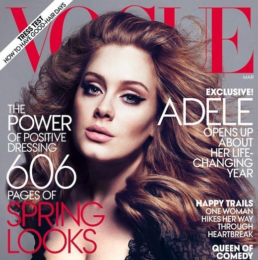
Bad assess get published on magazine covers, and in this addition of “Who Shot It Better” we have the duo of Mert Alas and Marcus Piggott with the March 2012 issue of Vogue and Simon Emmett with the April 2011 cover of Rolling Stone. Let’s take a gander.
When I first saw her on the Grammy’s with that blonde hair, the word that came to mind was “glamour,” but isn’t this Vogue! The stylist in this shot gets some props — lovely dress with an enticing, but not obscene amount of cleavage. The hair is beautiful, aided by some nice light. My main issue with stars on magazine covers is that you simply can’t get a sense of how much retouching is going on — Adele is only 23, so if you tell me her skin is very nice, I will believe you — but I’d love to see what the lighting looks like straight out of the camera. But even assuming the heavy hand of Photoshop, this is a lovely, seductive image.
Emmett’s image is also very nice. She’s less made up, hair’s a little messier, and the skin is more natural. The light isn’t as directional, and boy, does she have a pretty face. Some trolls have commented that her (double) chin was taken out of this photo. I believe it, but it doesn’t really diminish the photo for me. The pose is alluring, and I think I like the almost teen-age quality.
Verdict: I’ll tell ya. I liked glamour Adele at the Grammy’s because it was like a coming-out party of sorts, but I gotta go with the more natural approach of Simon Emmett. The lighting is more frontal, but it’s still nicely sculpted.
What do you think?
Simon Emmett by far!
Agreed, I like Simon’s more natural approach. Speaking of lots of retouching, one of my favorite Adele cover shots is still Rankin’s ( http://www.rankin.co.uk ) for Q Magazine ( http://bit.ly/yzVUSA )
Love the Rolling Stone cover. Adele is real and powerful and beautiful. All things captured in this simple image.
Emmett’s image does it for me. Adele’s face holds up well in a frontal shot because it has depth. A lot less Photoshop, too.
But I’m with Chris Owyoung: Rankin’s image blows both of these out of the water.
Personally I prefer the Rolling Stone version. But, I think each is appropriate for the given publication and their editorial content.
I like Emmett’s image better although Mert & Marcus’s style is nice – the problem is that they have made her look like a kind of transvestite hippo.
Having watched her interview on CBS, I like the Rolling Stone more-natural photo as being closer to the real Adele. However, I can agree that for Vogue to glamorize her is quite appropriate.
I like the 1st one more. But obviously it is less natural than the 2nd. Vicious circle …
Agreed, the Rolling Stone version is much more real and I think more enticing.
I prefer Emmett’s shot but also like the Vogue shots too. It’s a fine line but I’m going more au naturelle, even if it’s a well-prepped au naturelle.
Emmett’s by far. The Vogue cover looks great for what it is, but her face is so beautiful in the Rolling Stone image. By the way, these “Who Shot it Better?” posts are great, thanks for putting them together.
The Rolling Stone is more natural but feels a little sloppy and the hair looks a mess.. anyway why should natural automatically mean better?! Its each artists interpretation of the subject.. though the Vogue cover image specifically is the weakest of an other wise fine http://www.vogue.com/magazine/article/adele-one-and-only/#/magazine-gallery/adele-one-and-only/1 portfolio
Both are fantastic, but I think I’ll go with Emmett’s. I really like the natural look and feel of it.
toss up! love the look of the vogue cover, but the natural beauty shown on the RS cover is equally as lovely :) I agree with Tina***, vicious circle…
Emmett’s. I can actually tell it’s Adele. The Vogue cover looks like a caricature, the way things are accentuated and reduced.
Emmett by far
Hate them both. If you’re going to photograph someone, what’s the point of making them look like someone else. Neither of these are Adele.
SIddharth – you are absolutely right – why did Vogue choose that for the cover when they had those other amazing images to choose from. Wow, what a shoot – gorgeous gorgeous images. http://www.vogue.com/magazine/article/adele-one-and-only/#/magazine-gallery/adele-one-and-only/1
RS cover looks more like Adele. Both are gorgeous but, she’s gorgeous. She’d look great with a picture taken with a camera phone!
I wouldn’t say one is better than the other, I would say that they are both appropriate for the audience they are reaching. Look at the magazines Vogue is glam, ethereal, fashion which is exactly what Mert has nailed. Simon is shooting for an edgier audience with RS and as such has done an edgier image. While both are outstanding pictures in their own right, they are also spot on for the audience. Would either work for the other magazine…I don’t really think so, which is a testament to the photographers and CD’s for each magazine
Emmett / Rolling Stone, all the way. The Adele on that cover looks more like someone I might meet and want to talk to; the Adele on Vogue is someone I’d pass by on the street with hardly a second glance except to laugh at the big hair. Neither really remind me of Grammy Adele from last week but RS is closer.
Just hysterical. I have GOT to stay more current. I think both of them look ridicoulus, what’s with the lips??
One of my ex’es faves past flings was named Adele. This is just too funny.
I honestly think that each image works well with the intended audience of the respective publication. I personally like the vogue image because I make an aesthetic judgement based on the fact I find that image more pleasing.
The photo and processing on the Vogue cover wins it in my opinion. Great cover shot!
My god talk about overworked. The Vogue shot was great if you like illustrative photography that doesn’t actually look anything like the person. However Rolling Stone shot was far better quality and didn’t look like someone attacked a person who is larger than the average pop-queen and tried to shrink her down.
I actually do need someone to take my professional portrait, and if (in some alternate universe) I were lucky enough to have Adele’s stature & beauty that Vogue were even an option, I’d stay away from whoever it was who chose THAT particular photo of her – such an uncomfortable, downright icky, expression (and not in a good way)
They both work. Each goes to the current style for their covers and their respective audiences.
I like the RS cover by a mile. The vogue is way to fake for me. All in all though the Rankin is the best.
Rolling Stone / Emmett ALL THE WAY!!!
Adele (if you look at her interviews and performances) is a very straightforward and simple kind of singer, focusing more on the music than anything else and that Rolling Stone sover looks to me like that. She looks beautiful (cause she is a beautiful woman) but honest, straightforward, sexy, not over done!
The Complete Solution to Show & Sell Photography Online.
Step up to a more powerful photography website!
Try PhotoShelterContact us if you have a question!
T. (212) 206-0808 or send us a message
Our Client Services team is available to help you and answer your questions Monday through Friday from 9am - 6pm EST.
All photographs and illustrations that appear on the site are copyright of their respective owners.
©2005-2011 PhotoShelter, Inc.
Comments