Share
Who Shot It Better? Nicki Minaj: Howard Huang vs Pari Dukovic
I will admit this much. If you’re not into hip hop, you probably have never heard of Nicki Minaj. But you might have seen this: Ok, so now you kn...
I will admit this much. If you’re not into hip hop, you probably have never heard of Nicki Minaj. But you might have seen this:
Ok, so now you know what I’m talkin’ about. Nicki Minaj is a hyper successful hip hop artist who takes “harajuku” cool to another level. Her songs can be admittedly filthy, but they have the bounce that the kids like. (Darn kids!) Her latest album dropped this month, so she is understandably featured on many magazine covers. What a perfect time to duke it out on “Who Shot It Better?”

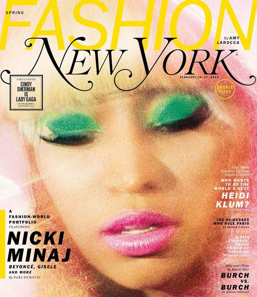
Pari Dukovic took this ethereal photo of Nicki for the February 20th issue of New York Magazine. It matches a lot of his fashion images with his use of heavy grain and motion blur. This image reminds me of champagne — or maybe what you’d get if you looked at Nicki through a flute of champagne (or perhaps after having consumed a few too many flutes of champagne). I like champagne and I like this image. I also really like this image he shot of Anna Wintour, which has the same vibe.

Howard Huang took this portrait of Nicki for the Spring issue of Paper magazine. First, let me say that I’ve been familiar with Howard’s work for almost 10 years, and I remember back in the day, he was still shooting a lot of hip hop/urban subjects with stylized lighting and solid commercial retouching. So I was pleasantly surprised to see that he was the photographer behind this image. It is a more literal interpretation of Nicki, but the lighting is nice. His key light is casting a shadow, but it’s not too hard and not too soft. The stylist and MUA did an excellent job, and the doe-eyed expression is classic Minaj. Lovely.
Verdict: People got upset when I picked the more conservative image of Michael Fassbender taken by Henry Leutwyler over the grittiness of Sebastian Kim. And I can understand that. But in this case, as much as I like Dukovic’s image, it doesn’t convey the essence of Nicki (in fact, it doesn’t really look like her to my eyes). So call me an old guy, but I like Huang’s image better because the portrait conveys Nicki’s quirkiness more effectively. Still love ya, Pari. Now turn on that super bass.
Previous Post: A Guided Tour of the New Image Browser
You May Also Like
-

Expert Advice and Top Tips from Pro Photographers for 2024
What’s one piece of advice you would give to aspiring or up-and-coming photographers? We asked nine experienced photographers and PhotoShelter members to share their top tips for those looking to get ahead in their photography careers. From finding your own visual voice to working with a mentor or photo assistant, each piece of advice listed […]
-

What’s On Your Photography Holiday Wish List?
The holiday season is around the corner and that means it’s the perfect opportunity to upgrade your gear or find that special gift for the visual storyteller or photography enthusiast in your life. We reached out to a handful of renowned photographers and PhotoShelter members, each with their unique styles and preferences, to bring you […]
-

Share a Photo That Means the World to You
We all have a photo that means the world to us. Maybe it’s one we made ourselves – the first photo from our first camera. It could be an old family photo in a beloved photo album. Or maybe it’s an iconic image that hangs on our wall at home. With World Photography Day coming […]