Share
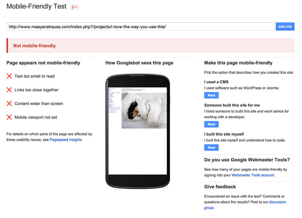
Is Your Website Still Mobile Unfriendly?
In May 2015, Google confirmed that mobile searches had exceed desktop searches in 10 countries including the US and Japan. This milestone had been ...
In May 2015, Google confirmed that mobile searches had exceed desktop searches in 10 countries including the US and Japan.
This milestone had been anticipated for some time, and reflected in an April 2015 change to their ranking algorithm, which heavily favored mobile-friendly sites during mobile searches. Mobile-friendly, in Google’s eyes, meant that the certain website characteristics where satisfied. For example:
- Text is large enough to read
- Links aren’t too close together
- Content width doesn’t exceed the screen size
- Mobile viewport is set
Google’s Mobile-Friendly Test provides an easy way to assess your website.
For many photographers, continually re-evaluating the state of their website is the furthest thought from their mind. Yet, our own mobile browsing experience validates what Google already knows: browsing a non-mobile friendly website on a tiny mobile device is painful – and often leads to abandonment.
You can argue the validity of more nuanced issues like e-commerce, mobile SEO, etc – but the ability to swipe between photos and easily navigate a site menu is indisputable. Your photography website must be mobile-friendly! Photographers using platforms like Indexibit or older services need to seriously re-evaluate whether their website is an effective marketing tool any more.
A mobile-friendly solution like PhotoShelter is an obvious solution, but there are many other options like WordPress that provide mobile-friendly templates if other tools like high-res file delivery, client proofing and e-commerce are not needed.
You May Also Like
-
Expert Advice and Top Tips from Pro Photographers for 2024
What’s one piece of advice you would give to aspiring or up-and-coming photographers? We asked nine experienced photographers and PhotoShelter members to share their top tips for those looking to get ahead in their photography careers. From finding your own visual voice to working with a mentor or photo assistant, each piece of advice listed […]
-
What’s On Your Photography Holiday Wish List?
The holiday season is around the corner and that means it’s the perfect opportunity to upgrade your gear or find that special gift for the visual storyteller or photography enthusiast in your life. We reached out to a handful of renowned photographers and PhotoShelter members, each with their unique styles and preferences, to bring you […]
-
Share a Photo That Means the World to You
We all have a photo that means the world to us. Maybe it’s one we made ourselves – the first photo from our first camera. It could be an old family photo in a beloved photo album. Or maybe it’s an iconic image that hangs on our wall at home. With World Photography Day coming […]