Share
Why Bother with a Redesign?
We’ve received a ton of positive feedback about our redesign, and we’re thrilled. But we have also received some comments about the weight of t...

We’ve received a ton of positive feedback about our redesign, and we’re thrilled. But we have also received some comments about the weight of the type face, the shelter logo, the colors, etc, so I wanted to clear up some misconceptions about the purpose and intent of the redesign.
 First the design isn’t about the logo. The logo is only a component of the redesign, and while it is the most obvious piece, it by no means represents the total goal. When we started this process with Cinco Design, the first thing they did was sit down and talk to a bunch of different people within our organization to understand what we thought of ourselves and how we are different. They synthesized all of this into a brand position piece. This is vitally important. I like to use Apple as the prototype of the successful brand. Apple isn’t a computer company (proof is that they dropped “Computers” from their legal name), but much more. “Clean,” “progressive,” “cool” are some words that I conjure up thinking about that brand. So the fact that their logo is an apple is irrelevant to the brand. Their industrial design, their ad campaigns, the mystery surrounding new product launches all contribute to defining their brand, and making you want to do business with them.
Cinco then surveyed all of our competitors and looked at how they were positioned and what their brands meant. We believe we’re different from everyone else, so we can’t have a brand and an identity that looks like a competitor.
So the design of the logo and the design of the site are reflective of their research and our feedback.
Let’s talk about the site. Some people said “I like the old site and logo better. It looked more professional.” Everyone is entitled to their opinion, but our goal wasn’t to just change the look and feel, it was to change the way a user interacts with the site. Specifically, we want to call attention to image buyers and have them do activity that would lead them to buy an image.
We tracked clicks on the homepage using what’s known as a “heat map.” Here’s the old site:
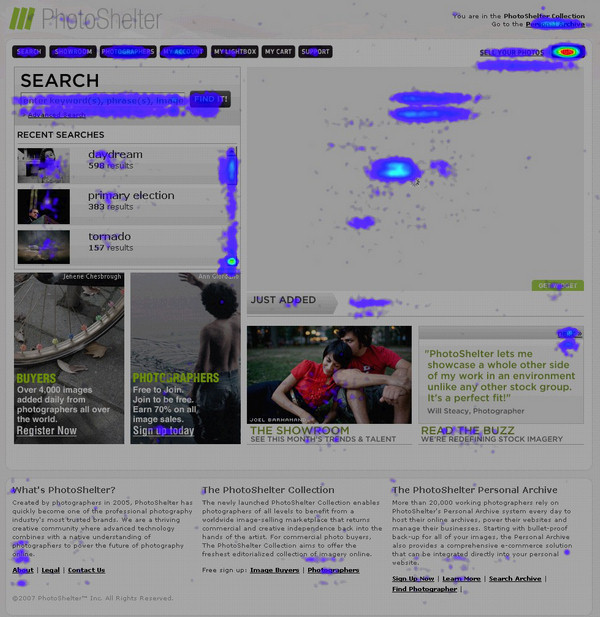
People were searching, clicking on some of the “most recently searched,” and clicking some large images. But there were also large swaths of area that weren’t being clicked, which means it’s a waste of space. We also felt that our most important commodity is our community of photographers, and we wanted to showcase the individuals more visibly on the homepage. Lastly, we also wanted photo buyers to interact with us even on days that they weren’t buying, which is one reason we launched our new blog.
Here’s the new heat map with one day of data:
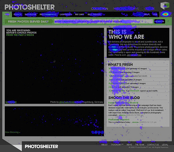 Now people are doing exactly what we want them to do. They’re searching, they are clicking on photographer names and statistics, they are interested in our “manifesto,” and they are traversing around the site to the blog, the personal archive, etc. Mission accomplished. So whether you like the new logo or not, you can’t dispute the efficacy of the new design, at least as far as our goals are concerned.
Next Post: Damn Right Your Dad Drank It!
Previous Post: Thank you very much, goodnight.
You May Also Like
-

Expert Advice and Top Tips from Pro Photographers for 2024
What’s one piece of advice you would give to aspiring or up-and-coming photographers? We asked nine experienced photographers and PhotoShelter members to share their top tips for those looking to get ahead in their photography careers. From finding your own visual voice to working with a mentor or photo assistant, each piece of advice listed […]
-

What’s On Your Photography Holiday Wish List?
The holiday season is around the corner and that means it’s the perfect opportunity to upgrade your gear or find that special gift for the visual storyteller or photography enthusiast in your life. We reached out to a handful of renowned photographers and PhotoShelter members, each with their unique styles and preferences, to bring you […]
-

Share a Photo That Means the World to You
We all have a photo that means the world to us. Maybe it’s one we made ourselves – the first photo from our first camera. It could be an old family photo in a beloved photo album. Or maybe it’s an iconic image that hangs on our wall at home. With World Photography Day coming […]