Share
Research Request System Feedback #2
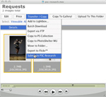
Watch our Research Request system video. (12.9MB Quicktime) Production value continues to be the main problem with the images that we’re seeing f...
Production value continues to be the main problem with the images that we’re seeing for the Research Request System. Before we get into the specifics, we encourage you to read our School of Stock article on production values, and then pay increasingly more attention to the way that images are used in the publications you read. Developing a critical eye to discern the differences between pro-quality images and amateur images is crucial.
The grades provided are for all the images we saw, not for the images that we’re using as examples.
Doctor in an office setting
Grade: C-
With HIPPA laws and the problems of general accessibility to a doctor’s office, the challenges of shooting medically-related imagery start before you even pick up the camera. Once you gain access, make the most of it by planning your shoot and ensuring that the production value of the images is high in every frame. This means paying attention to lighting, composition, styling, and casting (where applicable).
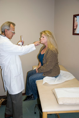
- Although it’s difficult to tell at this size, this photo isn’t quite in focus, so off the bat, it shouldn’t be submitted.
- There is an obvious hard shadow around the woman, which leads us to believe that this is an on-camera flash. This could be easily alleviated by using a flash cord so that the flash can be moved higher.
- Sloppy composition. The doctor’s back is cut off for no particular reason.

- Pay attention to backgrounds. There’s a piece of paper sticking out of the bookcase on the right. The books are tilted and sloppy.
- Pay attention to styling. The choice of glasses is too “trendy,” and will significantly impact the longevity of this image as stock.
- Doesn’t quite match “office setting” part of the request. This is more like “Doctor in a library.”
- Casting is slightly questionable in that the model looks like he is 16 years old. In many respects, our visceral reaction to the image is the only one that matters, so if people think this is “Doogie Howser” instead of a “Doctor in an office setting,” then we haven’t succeeded.
Images of finance, job market (successful businessman/woman) and food
Grade: B-
- This is a “believable” image — not overtly posed, and you can buy that this guy is an actual businessman.
- Shine on the forehead should be reduced either by powder (pre), or with Photoshop (post)
- Ringflash is a gimmicky lighting style, but it’s not so objectionable here.
- Background is a bit distracting. Would have preferred either a white/gray background, or eliminating the “hang” of the fabric.
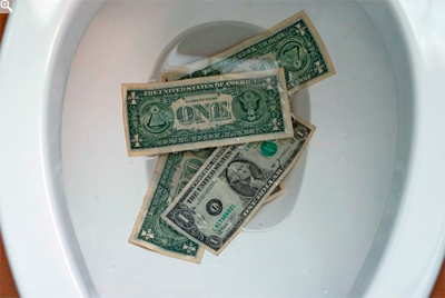
- Mixed lighting sources. When you have a completely controlled environment like a bathroom, there is no reason to have imperfections. Everyone knows toilets are white, and yet there is an orange glow on the left hand side of the photo from an incandescent light.
- Conceptually, the image is ok, but the lighting is poor.
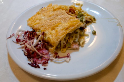
- Rule #1 of food photography: The image should make you want to eat it. In that respect, this image fails.
- Lighting is mixed again. Make it “light and airy,” and white balance needs to be totally neutral.
- This is an obvious case of needing a food stylist (or at a minimum pay attention to detail). There is melted cheese strands on the right of the plate. The cabbage and main dish really look unappetizing. Pick up a copy of Gourmet if you want to see contemporary food imagery.
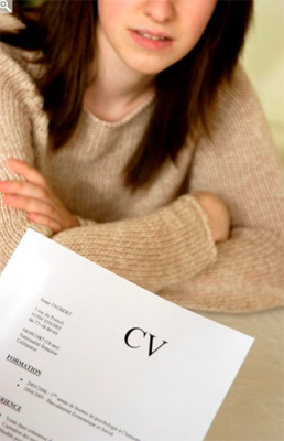
- It’s a little “stocky” but it’ll work well for an article on job interview or how to write an resume
- There’s a slight orange cast to the image. Neutralize the white balance a little better.
- This is a great example of thinking globally. “CV” is used a lot in Europe but not so frequently in the US. If you have the model and location all set up, you might as well have another document that says “Resume” on it.
- We’re assuming the contact information on the CV is fictitious
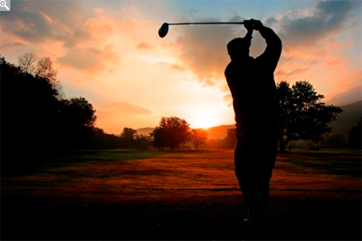
Travel, Leisure and Golf Spec Lightbox Request
Grade: D
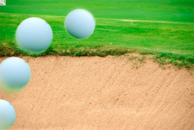
- Unless the request specifically states “photo illustration,” you shouldn’t submit them
- This image doesn’t make me want to play golf. It just looks a little silly.
- Good composition, good exposure
- FYI: Most full-time golf publications shy away from the silhouette because they consider them dated.
Next Post: Airplanes, Rare Clouds, and a Baton Toss
Previous Post: Noah Kalina and Seed Magazine
You May Also Like
-

Expert Advice and Top Tips from Pro Photographers for 2024
What’s one piece of advice you would give to aspiring or up-and-coming photographers? We asked nine experienced photographers and PhotoShelter members to share their top tips for those looking to get ahead in their photography careers. From finding your own visual voice to working with a mentor or photo assistant, each piece of advice listed […]
-

What’s On Your Photography Holiday Wish List?
The holiday season is around the corner and that means it’s the perfect opportunity to upgrade your gear or find that special gift for the visual storyteller or photography enthusiast in your life. We reached out to a handful of renowned photographers and PhotoShelter members, each with their unique styles and preferences, to bring you […]
-

Share a Photo That Means the World to You
We all have a photo that means the world to us. Maybe it’s one we made ourselves – the first photo from our first camera. It could be an old family photo in a beloved photo album. Or maybe it’s an iconic image that hangs on our wall at home. With World Photography Day coming […]