Share
How to Sell Your Travel Photos: Visual Examples
If you’ve already read our Primer on Travel Photography for Stock Photography, then you’re already briefed on some of the do’s and don’t fo...
If you’ve already read our Primer on Travel Photography for Stock Photography, then you’re already briefed on some of the do’s and don’t for stock-quality travel images. This article will give you more visual comparisons of accepted, borderline and rejected images that our photo editors have seen in their queues.
Arguably, the number one goal of a travel stock image is to make the viewer want to visit that destination. The image needs to strike the right balance of informational and aspirational content. A very banal image of a sunset might be aspirational, but it’s not informational. A street scene might be the opposite.
As you view these visual examples, you will likely find individual images that you disagree with. However, we encourage you to spend time looking at the level of quality of the accepted imagery to understand where the general bar is set for these travel-related images.
Lastly, the number of images we have of any specific location will affect the acceptance rates of other images of the same subject matter. The PhotoShelter Collection contains many images of the London Eye, but not many of Makapu’u Beach in Hawai’i, so the bar will be lower in the latter.
Beaches & Bodies of Water
Accepted:
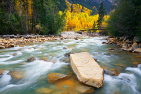
Photo by Zach Holmes / #PSC000833428
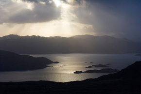
Photo by Jevgenija Pigozne / #PSC001185375
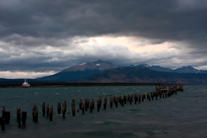
Photo by John Smith/ #PSC001226979

Photo by Doug Dailey/ #PSC001252628
- Exposure are highly accurate
- Good composition (e.g. vanishing point in the old pier)
- Sharp focus
- Good tonal range
Borderline:
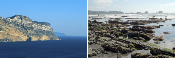
- Although it might be hard to see at this size, neither photo is really sharp, in part because of the sea mist and time of day
- Tilted horizon
- Light is not flattering
Reject:
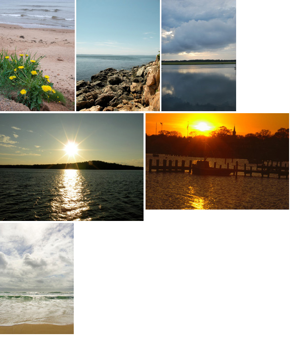
- Tilted horizons
- Poor point of view and composition
- Doesn’t convey enough information about the location. Rocks and the ocean are very generic. Try harder to frame a composition that conveys something unique.
- Mediocre photos don’t make the viewer want to visit.
- If the image does not succeed in
identifying a specific place, it must be aesthetically superior (i.e.
the iconic beach shot)
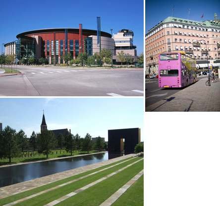
Cityscapes & Vistas
Cityscapes Accepted
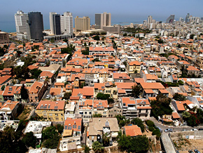
Photo by Photostock Israel / #PSC001240951
- An elevated position gives the viewer a more unique view of the city.
Cityscapes Rejected:
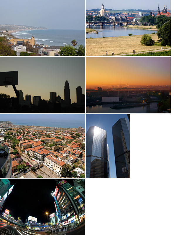
- Images 1-4 have poor composition, and are more akin to a snapshot that an amateur would take. Exposure and clarity are poor.
- Image 5 is a take from the same photographer. In this case, the inclusion of the balcony made this image less desirable than the accepted image. Details matter.
- Image 6: We receive so many “modern building” images. Although they can be graphically bold, this image has a major glare spot. Had the photographer “waited for the light,” this might have been more successful.
- Image 7: This ground-level fisheye image is too distorted.
- Be mindful of large foreground areas that add nothing to the photo.
Details
Details can often give the viewer a sense of an area that cannot be captured in wide vistas alone.
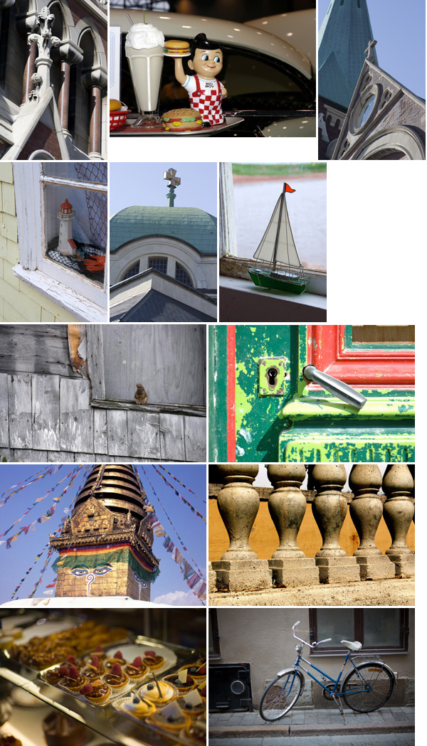
Details Accepted:

Photo by Noah Hutson / #PSC001197737
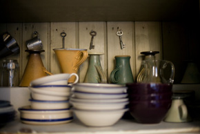
Photo by Meg Wachter / #PSC001190239
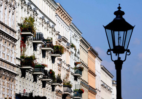
Photo by Jochen Eckel / #PSC001279094

Photo by Noah Hutson / #PSC001197735

Photo by Tedd Liggett / #PSC001234010

Photo by Robert Cabrera / #PSC001244365
- Exposures are accurate
- Ratio of darkest and lightest portions of the images are balanced (i.e. no harsh shadows)
- Even in lower light situations, the images are free of camera shake and excessive noise
- Close-ups are in focus
Details Borderline:
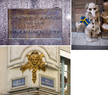
- Image 1: This faceplate commemorating Jim Morrison of the Doors is noteworthy, however, the lighting leaves much to be desired.
- Image 2-3: These are average compositionally, but were accepted because they are iconic for the location.
Details Rejected:
- Poor lighting conditions affect many of these images whereby the detail definition is obscured by heavy shadows
- Color balance is problematic especially in the dessert case
- Many of these image aren’t detailed enough. The photographer needs to get closer to the detail to make them more effective.
- Separation of foreground/background elements would allow details to pop
- Mind the backgrounds!
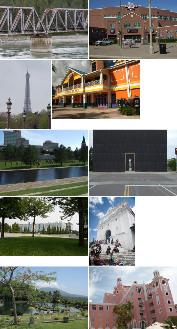
Landmarks & Attractions
The bar for accepting known landmarks is justifiably high as many people visit these popular destinations and take a huge volume of photos. The successful photo takes a different point of view and is free of technical defects.
Landmarks Accepted
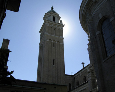
Photo by Gary Crabbe / #PSC001190985
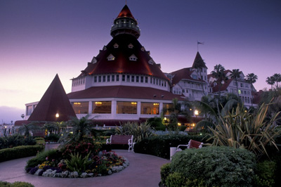
Photo by Gary Crabbe / #PSC001209944
Photo by Lincoln Barbour / #PSC001201140
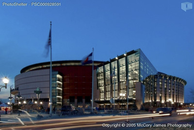
Photo by James McCory / #PSC000928591
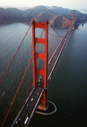
Photo by William Welch / #PSC001194172
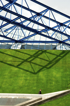
Photo by David Bukach / #PSC001238711
- Graphic compositions
- Expert exposure
- Points of view that enhance the landmarks
Landmarks Borderline
- All three images were shot in the middle of day which causes lots of problems with shadows and exposure
- Image 1: The street is overly prominent and distracts from the landmark
- Image 2: Is this a picture of the bus or the building? A poor point of view makes this image less successful.
Landmarks Rejected:
- Most of the images exhibit poor/banal composition, and don’t create visual excitement.
- Straighten your horizons!
- Image 6 is more about the road than the memorial.
- Image 8 is distracting because of the people (tourists, bored trinket salesmen)
Marinas
Marinas are difficult to shoot because of the visual clutter that occurs at ground level, and as such, these types of photos give a very poor idea of the surrounding area.
Marinas Accepted: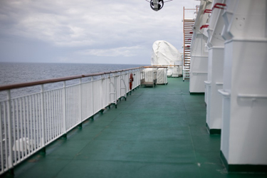
Photo by Meg Wachter / #PSC001191436
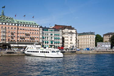
Photo by Meg Wachter / #PSC001189712
- Image 1: a slightly different perspective with some depth-of-field
- Image 2: pulled back, we get a sense of the adjacent buildings
Marinas Rejected:
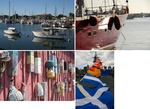
- Image 1: Really indicative of 90% of the marina images we receive. A boat amidst a thousand masts is not visually interesting, nor does it give us a sense of the area. It’s very generic.
- Image 2: Poor composition and exposure
- Image 3: Poorly executed detail. Shadows are also distracting.
- Image 4: The colors stand out, but the composition is poor. We can’t really tell what this is, or where it is. If a photo editor was trying to illustrate a story about the deck of a destroyer, this image probably wouldn’t be in consideration.
Markets & Things for Sale
Accepted:

Photo by PhotoStock Israel / #PSC001241024

Photo by PhotoStock Israel / #PSC001241025

Photo by PhotoStock Israel / #PSC001240995
- By focusing on indigenous people participating in the market, we get more of a sense of its authenticity vs. a marketplace filled with tourists buying cheap trinkets.
Markets Borderline:
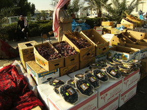
- Images of food stands are tough because they are so common. In this case, there is enough contextual information (e.g. the keffiyeh, the middle-eastern fruits)
Markets Rejected:
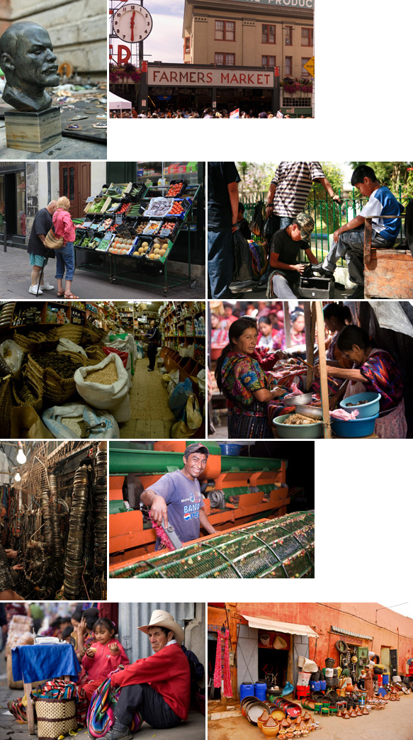
- Image 1: Cut off the head
- Image 2: Poor composition. Centering the sign doesn’t mean that it’s a good picture.
- Image 3: Tourists looking at a street vendor display (with the feet cut off) is a poor composition
- Many of the images have lighting problems (heavy shadows, poor white balance, etc)
- The images should make the viewer want to visit. The inclusion of destitute people in a mediocre composition has a poor chance of selling — irrespective of how accurately the image portrays the reality of the situation.
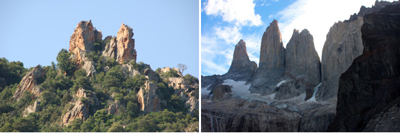
Mountains & Formations
Accepted:

Photo by John Smith / #PSC001226987
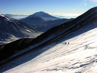
Photo by David Molina / #PSC001197083
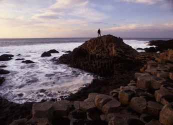
Photo by Paul Felix / #PSC001251787
Photo by Paul Felix / #PSC001251776
- Good composition with a well-formed understanding of foreground and background elements
- No technical issues
Mountains Borderline:
- The images are acceptable compositionally, but photographers did not “wait” for the light
Mountains Rejected:
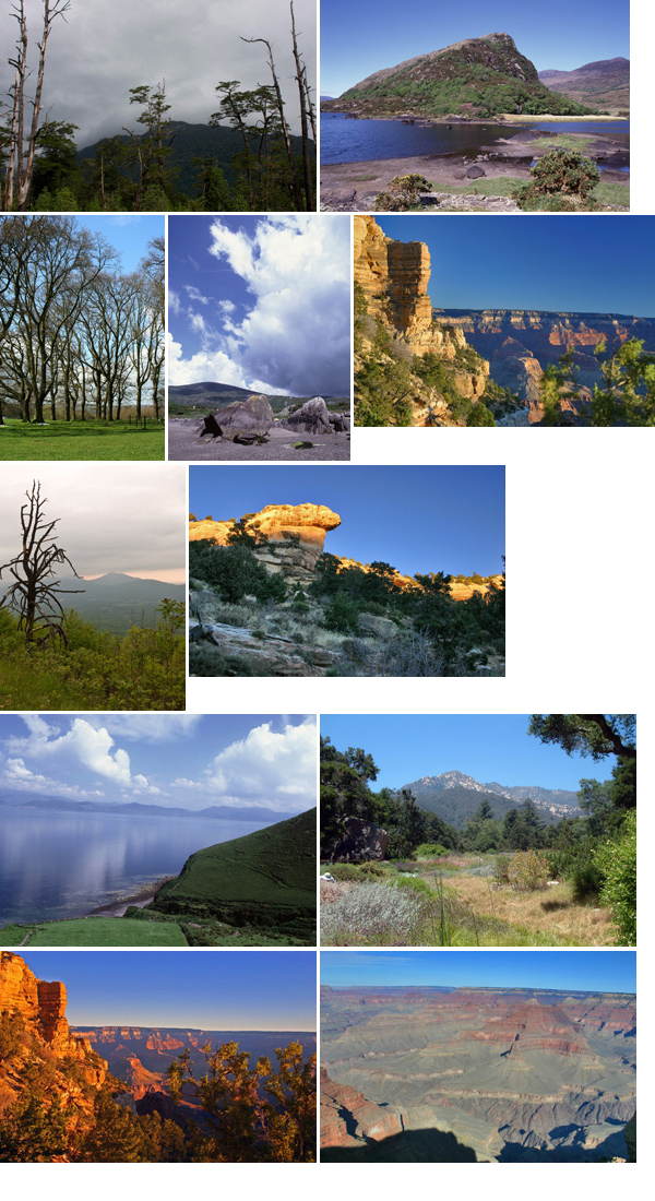
- Image 1: Poor composition. What is the subject of the image?
- Image 3: We receive huge amounts of this type of composition (trees on a grassy knoll). As a travel image, it’s doesn’t accomplish the goal of making a viewer want to be there.
- Image 4/9: This angle of the Grand Canyon is awkward, and compared to other images we have of the monument, it isn’t good enough for inclusion.
- Image 7: Although the light is interesting, the composition isn’t compelling.
Scenes with Local People
In keeping with the goal of creating images that compel the viewer to want to visit the locale, images with local people shouldn’t depict them as destitute or sickly, even if that is the reality of the situation. Travel imagery is aspirational, not documentary.
Accepted: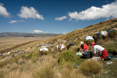
Photo by PhotoStock Israel / #PSC001240691

Photo by Ahmad Faizal Yahya / #PSC001224399
Photo by David Brody / #PSC001244064
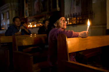
Photo by PhotoStock Israel / #PSC001241032

Photo by Ahmad Faizal Yahya / #PSC001224333
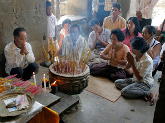
Photo by Jochen Eckel / #PSC001263007
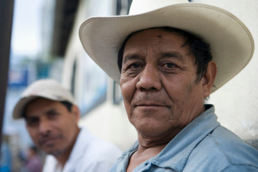
Photo by PhotoStock Israel / #PSC001240971
- People look healthy and generally happy (or at the very least, neutral)
- A good mix of environmental portraits to larger crowds
- Most of the images include enough contextual information to inform the viewer that they are someplace foreign
Borderline:
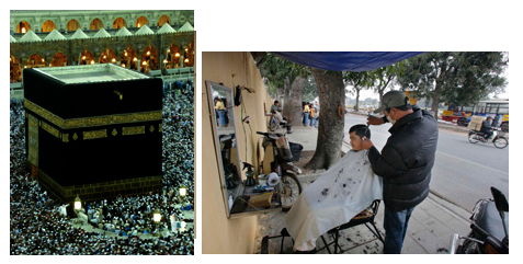
- Image 1: Accepted Haj image is much stronger compositionally, and better exposure
- Image 2: Photographer could have worked the scene harder playing with different distances to the subject to create a more compelling image.
Rejected:
- Image 1: Poor composition, internal reflections in lens from the candles
- Image 2/3: Blurry.
- Image 4: What does this photo tell us about the area or the people? Average composition under poor lighting conditions.
- Image 5-6: Average compositions. What’s in the pot would be more interesting than the pot cover.
- Image 7: What are we looking at? What does this tell us about the locale?
- Image 8: Poor composition and horrendous lighting condition
- Image 8: Why are we looking at their backs? Need to get closer and need more contextual information.
- Image 9: Figure is blending in with foreground. Poor composition.
- Image 10/11: Poor composition, cutting off details for no reason. Subject matter uninteresting.
- Image 12: Hard flash. Capturing woman with mouth open and shoving food in her mouth isn’t appealing.
- Image 12: Image of nothing.
- Image 13/16: These are examples of destitute-looking locals. They exist in every local, and they are unappealing in every context.
Signs
Accepted:
Photo by John Gaffen / #PSC001235019
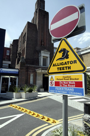
Photo by John Gaffen / #PSC001260562
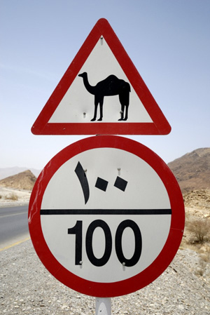
Photo by Iain Lowson / #PSC001141716
- Well-composed and exposed
- Generally have contextual information for us to understand the relevance of the sign (e.g. the “Alligator Teeth” sign shows the teeth in the background)
- Might be quirky and geographically specific (e.g. the camel sign)
Rejected:

- Image 1: Poor contrast, difficult to read
- Image 2: Too far away, plus what is it a sign of? A winery sign on the side of a road is hardly interesting
- Image 3: Not sharp, and what is the relevance?
Next Post: Submerged with John Clang
Previous Post: Red Camera (Again)
You May Also Like
-

Expert Advice and Top Tips from Pro Photographers for 2024
What’s one piece of advice you would give to aspiring or up-and-coming photographers? We asked nine experienced photographers and PhotoShelter members to share their top tips for those looking to get ahead in their photography careers. From finding your own visual voice to working with a mentor or photo assistant, each piece of advice listed […]
-

What’s On Your Photography Holiday Wish List?
The holiday season is around the corner and that means it’s the perfect opportunity to upgrade your gear or find that special gift for the visual storyteller or photography enthusiast in your life. We reached out to a handful of renowned photographers and PhotoShelter members, each with their unique styles and preferences, to bring you […]
-

Share a Photo That Means the World to You
We all have a photo that means the world to us. Maybe it’s one we made ourselves – the first photo from our first camera. It could be an old family photo in a beloved photo album. Or maybe it’s an iconic image that hangs on our wall at home. With World Photography Day coming […]