Share
Getting More Advanced With The Photo Wall
PhotoShelter members are continuing to make some very creative use of the new “photo wall” feature. Within the first 5 days of its availability...
PhotoShelter members are continuing to make some very creative use of the new “photo wall” feature. Within the first 5 days of its availability, nearly 700 people have already implemented the Photo Wall into their websites.
In my previous post, I showed some examples of the “early adopters” who used the Photo Wall in conjunction with some of the standard PhotoShelter website templates, and included their “recipe” (the settings they’re using to achieve their particular look.)
This post, we get a little more advanced by showing people who are using the Photo Wall in their WordPress blogs using Graph Paper Press themes, and one person (Andes Lo, below) who used the PhotoShelter Southpaw theme, but modified the CSS coding a bit.

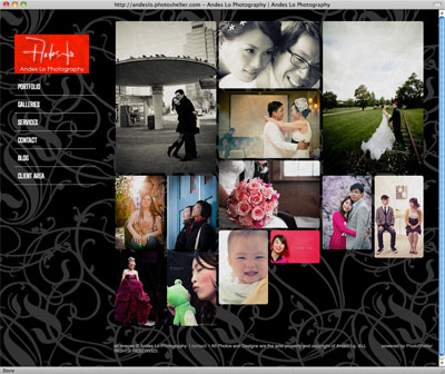
Theme: Southpaw
Style: Ink
Aspect: Natural
Padding Between Thumbs: 3 pixels
Rounded Corners: 5 pixel radius
Half-size thumbnails: Use for small feature/less recent galleries
Show Gallery Name: Only on hover
Watermark larger images: No
Note: Modified the CSS coding to change the background and added a logo.
The examples shown in this post required some knowledge of CSS coding.
This week’s “theme” here on the blog is the new Photo Wall feature, where I show off the various ways PhotoShelter members are putting it to work for their websites. The next post will showcase some people who are using it in their own designs using manual mode.

Theme: Graph Paper Press
Style: Widescreen
Aspect: Square
Padding Between Thumbs: None
Rounded Corners: Don’t round
Half-size thumbnails: Use for small feature/less recent galleries
Show Gallery Name: Only on hover
Watermark larger images: NoNote: He modified the CSS code to change the way the text displays when the mouse rolls over the image.

Theme: Graph Paper Press
Style: Widescreen
Aspect: Natural
Padding Between Thumbs: 3 pixels
Rounded Corners: 8 pixel radius
Half-size thumbnails: Don’t use
Show Gallery Name: Only on hover
Watermark larger images: No
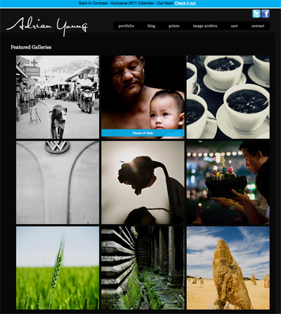
Theme: Manual Customization
Aspect: Square
Padding Between Thumbs: 4 pixels
Rounded Corners: 0
Half-size thumbnails: Don’t use
Show Gallery Name: Only on hover with CSS modification
Watermark larger images: No
Here’s what his gallery name looks like on hover:
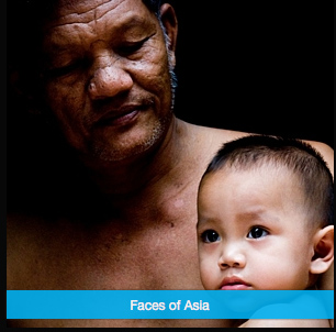
Using CSS, Adrian centered the text, changed the text color to white, changed the background color to blue (#00a0f0) and changed the width to “auto” (100%).

Theme: Graph Paper Press
Style: Modularity
Aspect: Natural
Padding Between Thumbs: 1 pixel
Rounded Corners: 3 pixel radius
Half-size thumbnails: Use for small feature/less recent galleries
Show Gallery Name: Only on hover
Watermark larger images: No

Theme: Graph Paper Press
Style: On Assignment
Aspect: Rectangular
Padding Between Thumbs: 3 pixels
Rounded Corners: 8 pixel radius
Half-size thumbnails: Don’t use
Show Gallery Name: Only on hover
Watermark larger images: No
CHRISTOPHER SMITH, FRAMING THE PLANET

Theme: Graph Paper Press
Style: Wide Screen, in Manual Mode
Aspect: Natural
Padding Between Thumbs: None
Rounded Corners: Don’t round
Half-size thumbnails: Don’t use
Show Gallery Name: Only on hover
Watermark larger images: Yes
Theme: Graph Paper Press
Style: Manual Mode
Aspect: Natural
Padding Between Thumbs: 10 pixels
Rounded Corners: 8 pixel radius
Half-size thumbnails: Use for small feature/less recent galleries
Show Gallery Name: Only on hover
Watermark larger images: No

Theme: Graph Paper Press
Style: Manual Mode
Aspect: Rectangular
Padding Between Thumbs: None
Rounded Corners: Don’t round
Half-size thumbnails: Use for small feature/less recent galleries
Show Gallery Name: Only on hover
Watermark larger images: YesNote: He is using the Photo Wall at the bottom of his front page, to show off his recently updated galleries.
You May Also Like
-

Expert Advice and Top Tips from Pro Photographers for 2024
What’s one piece of advice you would give to aspiring or up-and-coming photographers? We asked nine experienced photographers and PhotoShelter members to share their top tips for those looking to get ahead in their photography careers. From finding your own visual voice to working with a mentor or photo assistant, each piece of advice listed […]
-

What’s On Your Photography Holiday Wish List?
The holiday season is around the corner and that means it’s the perfect opportunity to upgrade your gear or find that special gift for the visual storyteller or photography enthusiast in your life. We reached out to a handful of renowned photographers and PhotoShelter members, each with their unique styles and preferences, to bring you […]
-

Share a Photo That Means the World to You
We all have a photo that means the world to us. Maybe it’s one we made ourselves – the first photo from our first camera. It could be an old family photo in a beloved photo album. Or maybe it’s an iconic image that hangs on our wall at home. With World Photography Day coming […]