Share
Who Shot it Better? Simon Bruty vs. Bob Rosato: Tom Brady
Well, well, well, the Super Bowl is nearly upon us once again, and Tom Brady is back in the big game. So it’s a perfect time to compare and contr...
Well, well, well, the Super Bowl is nearly upon us once again, and Tom Brady is back in the big game. So it’s a perfect time to compare and contrast photos of Mr. Bundchen from the cover of Sports Illustrated. In this episode of “Vs.” we contrast the in-game photo stylings of staffers Simon Bruty and former staffer Bob Rosato. This particular comparison is a bit different from the others in that Mr. Brady wasn’t posing, and the choice of photo was more a function of the photo editors, but let’s take a look.

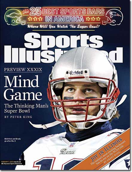
This February 7, 2005 cover featured the headline of “Mind Game,” and the photo matches it accordingly. Brady is glancing upwards in a thoughtful expression. It’s no Tebow (or Rodin for that matter), but the photo is well-exposed, the uniform color and background color work well, and the crop is solid.

Remember how angry Brady played in the Denver-Patriots game? Everyone was talking about Tebow, very few people were talking about Brady, despite the fact that he has more Super Bowl rings than the number of years Tebow has played in the league. That makes Brady mad. The January 30, 2011 cover features Simon Bruty’s image with Brady facing the same direction and with a similar crop, but he’s mad. Hulk mad. A little older. Hasn’t been to the dance in a few years. Has a bit of a chip on his shoulder, and the photo shows it.
Verdict: Bruty. I’ve always like Batman over Superman, and that’s basically what you have here. Bruce Wayne juxtaposed next to Clark Kent. The primal scream of the old veteran with a chip on his shoulder. Again, i wouldn’t say one photo is better than the other, it’s more of a visceral reaction of how an emotion-expressing photo is paired with an editorial message. By the way, GO GIANTS!
Next Post: A Better Sales Process for Your Customers
Previous Post: Rant: I Love Photography
You May Also Like
-

Expert Advice and Top Tips from Pro Photographers for 2024
What’s one piece of advice you would give to aspiring or up-and-coming photographers? We asked nine experienced photographers and PhotoShelter members to share their top tips for those looking to get ahead in their photography careers. From finding your own visual voice to working with a mentor or photo assistant, each piece of advice listed […]
-

What’s On Your Photography Holiday Wish List?
The holiday season is around the corner and that means it’s the perfect opportunity to upgrade your gear or find that special gift for the visual storyteller or photography enthusiast in your life. We reached out to a handful of renowned photographers and PhotoShelter members, each with their unique styles and preferences, to bring you […]
-

Share a Photo That Means the World to You
We all have a photo that means the world to us. Maybe it’s one we made ourselves – the first photo from our first camera. It could be an old family photo in a beloved photo album. Or maybe it’s an iconic image that hangs on our wall at home. With World Photography Day coming […]