Share
Who Shot It Better? Emma Watson: Alexei Hay vs. Vincent Peters
Many of the most popular magazines have international versions and it’s not so surprising to see the same person featured in multiple countries. ...
Many of the most popular magazines have international versions and it’s not so surprising to see the same person featured in multiple countries. Slightly more surprising is hiring different photographers to shoot the same subject for the same month in essentially the same magazine. But let’s chalk that up to a little, um, wizardry, shall we?
Emma supposedly did the dual covers to promote her upcoming movie The Perks of Being a Wallflower – her first big role since Harry Potter 1, 2, 3, 4, 5, 6, 7, 8 and 8 part 2.
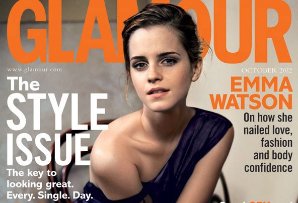
Before we get into the subjective exercise of comparing one photograph to another, let’s talk about intent. I would argue the “point” of the cover photo is to show that Ms. Watson has grown up and moving into the second phase of her career. The ideal photo, then, will provide a contrast to the wand-wielding chic of yesteryear.
Let’s take a gander.

In the U.S., Glamour tapped NY-based Alexei Hay, who grew up assisting the likes of heavyweights Philip Lorca DiCorcia and Albert Watson. Emma is styled a la “rocker chic” with that dark makeup and messy hair. The light is directional, but it ain’t subtle and it’s fairly contrasty judging by the shadow under her chin. And there’s a bonus by buying the magazine – a unique list of the 30 best beauty buys EVER! (that was sarcasm, by the way)

UK-based Vincent Peters photographed Emma wearing Zac Posen. Although they had to hire another photographer, at least they saved on travel costs, right? Vincent’s photo has some interesting shadows that are being cast by the light that’s coming over her right shoulder. The key light is softer than Alexi’s, and the overall mood is more sophisticated. He also has this lovely black-and-white, which I think is absolutely fantastic.

Verdict: If we’re working with the premise that the photo’s intent is to paint Emma as non-child, then I would argue that Alexi’s photo is more effective. But I made up that premise, and I would say that the U.S. image is a bit predictable for Glamour. I mean it looks like a Glamour image, doesn’t it (“Oh, you Americans are so predictable”)? So while Alexi’s image says “I’m a badass now, not a kid” more effectively, I personally like Vincent’s image better. And I like his black and white portrait even more, but that’s not the kind of image we put on a magazine cover now is it…
Next Post: Friday Happy Hour: Photokina Wrap-Up & More
Previous Post: Photos of What It Looks Like To Be a Democrat
You May Also Like
-

Expert Advice and Top Tips from Pro Photographers for 2024
What’s one piece of advice you would give to aspiring or up-and-coming photographers? We asked nine experienced photographers and PhotoShelter members to share their top tips for those looking to get ahead in their photography careers. From finding your own visual voice to working with a mentor or photo assistant, each piece of advice listed […]
-

What’s On Your Photography Holiday Wish List?
The holiday season is around the corner and that means it’s the perfect opportunity to upgrade your gear or find that special gift for the visual storyteller or photography enthusiast in your life. We reached out to a handful of renowned photographers and PhotoShelter members, each with their unique styles and preferences, to bring you […]
-

Share a Photo That Means the World to You
We all have a photo that means the world to us. Maybe it’s one we made ourselves – the first photo from our first camera. It could be an old family photo in a beloved photo album. Or maybe it’s an iconic image that hangs on our wall at home. With World Photography Day coming […]