Share
Red Bull Didn’t Need to Use Art Filters to Make Felix Baumgartner Look Cool
I’ve been following the progress of the Red Bull Stratos project for several years, so I was thrilled to watch the livecast on YouTube of Felix B...
I’ve been following the progress of the Red Bull Stratos project for several years, so I was thrilled to watch the livecast on YouTube of Felix Baumgartner’s historic jump on Sunday. I felt anxiety, inspiration, and astonishment as the capsule ascended and Felix so casually stepped off the platform into a 24 mile descent with only a parachute on his back. I wondered how many times he peed in the suit, but that is neither here nor there.
During the past year, I’ve really enjoyed seeing some of the incredible images that were created with various custom rigs that made documenting the project possible. But one thing bothered me, and that was the use of art filters on the images that Red Bull was distributing through its gallery. Because here’s the thing: Felix is a badass, and a good looking one at that. We don’t need some cinematic desaturation applied to the images to make them more iconic. Do we?
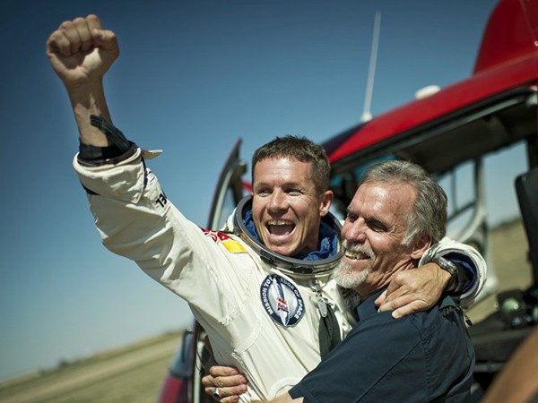
For example, look at this image taken just moments after he landed:

Source: Red Bull Stratos
I’ve spent a few years on earth, so I’m pretty familiar with the color of the sky, and it wouldn’t be a stretch to say that this looks fairly color accurate for the middle of the day in the Southwest.
Here’s another photo from the same photographer at nearly the same time:

Source: Red Bull Stratos
I’m willing to accept that at a wide aperture, there was some vignetting on the image. But the color change is pretty extreme, and this isn’t a white balance issue. The image has been manipulated to give it this look-and-feel. Does it look like a film still from The Felix Baumgartner Story? Yeah, I thought so too.
Here’s another image from some training sessions:

Source: Red Bull Stratos
The color seems fairly accurate, but I suspect there has been some burning of the corners. Nothing egregious, mind you, and who knows what the color temperature of the indoors lights are. And here’s a closer “portrait”:

Source: Red Bull Stratos
As a portrait, I think it’s pretty damn awesome. But as a “journalistic” image (and perhaps I’m being overly prescriptive in assigning a genre of photography to these images), it’s too much.
But even if you think that these images are meant for PR, and not as a photojournalistic record of the jump and training that preceded it, where is the visual consistency? I like making my images look as cool as possible too, but jumping out of a metal capsule from 128,000 feet and breaking the speed of sound doesn’t need any manipulation.
You May Also Like
-

Expert Advice and Top Tips from Pro Photographers for 2024
What’s one piece of advice you would give to aspiring or up-and-coming photographers? We asked nine experienced photographers and PhotoShelter members to share their top tips for those looking to get ahead in their photography careers. From finding your own visual voice to working with a mentor or photo assistant, each piece of advice listed […]
-

What’s On Your Photography Holiday Wish List?
The holiday season is around the corner and that means it’s the perfect opportunity to upgrade your gear or find that special gift for the visual storyteller or photography enthusiast in your life. We reached out to a handful of renowned photographers and PhotoShelter members, each with their unique styles and preferences, to bring you […]
-

Share a Photo That Means the World to You
We all have a photo that means the world to us. Maybe it’s one we made ourselves – the first photo from our first camera. It could be an old family photo in a beloved photo album. Or maybe it’s an iconic image that hangs on our wall at home. With World Photography Day coming […]