Share
On Design: Searching for a More Visual News Site
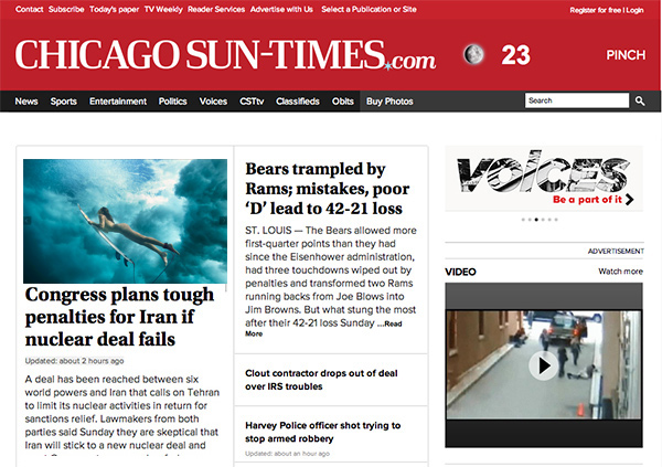
When the Chicago Sun-Times laid off its entire photo staff last year, I commented that one of the problems was the utter failure of website design ...
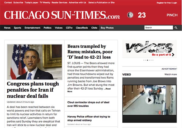
When the Chicago Sun-Times laid off its entire photo staff last year, I commented that one of the problems was the utter failure of website design to appropriately showcase photography. Here is an example of the current design and the way photography is displayed:
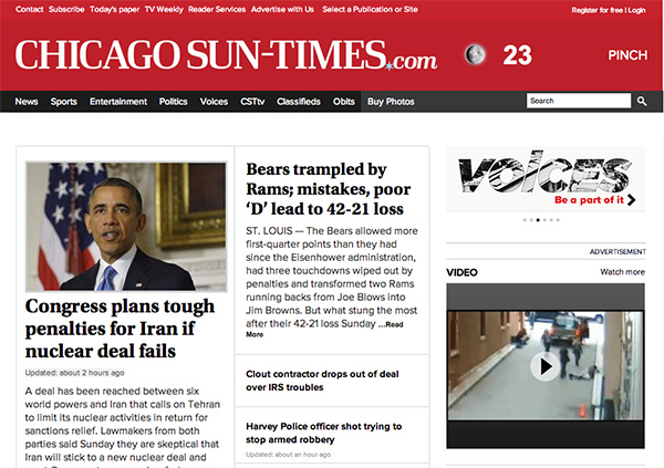
The only image that appears “above the fold” is a staggering 306 pixels wide.
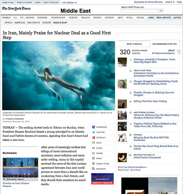
Design is a much higher priority at The New York Times, and they have a few distinct layouts: 1) lede image, 2) lede image + slideshow, 3) sidebar image, 4) dedicated slideshow, 5) Lens blog. Here’s what they look like:
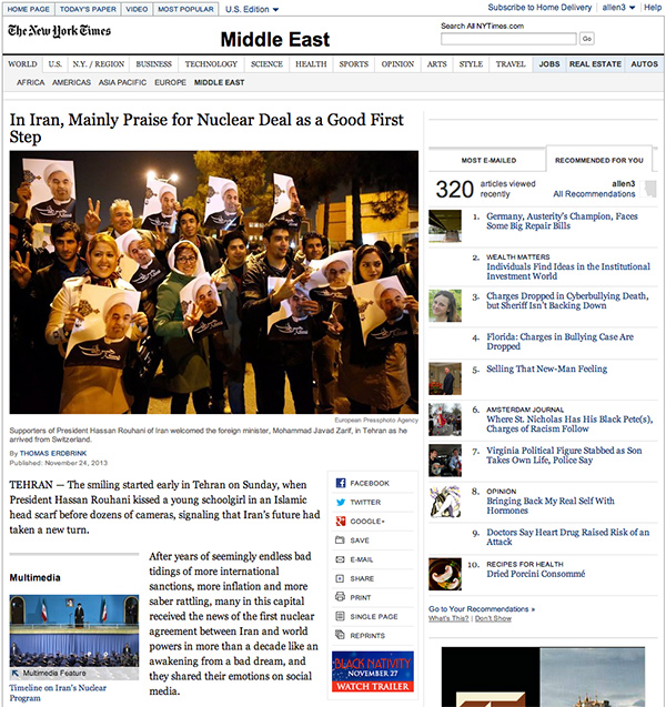
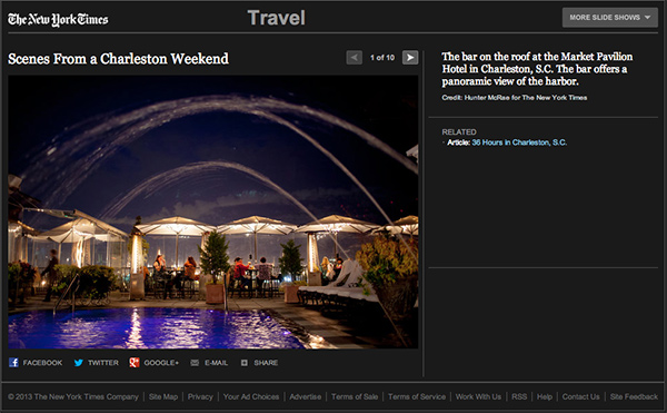
Lede image (600px) plus slideshow preview (190px)
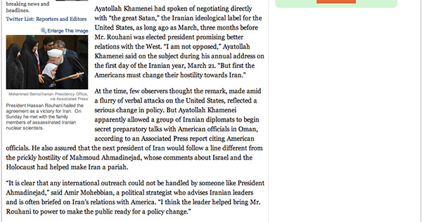
Sidebar image (190px)
Dedicated slideshow (600px)
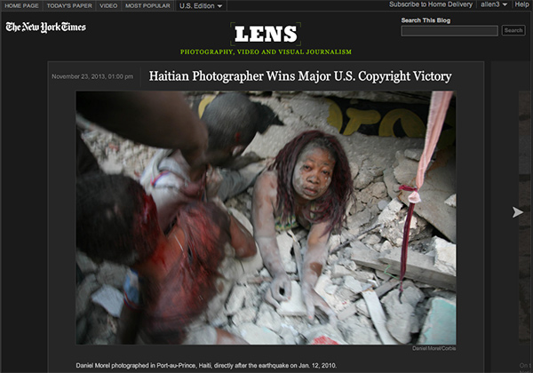
LENS blog
I would still argue that these designs aren’t optimal for photography. Photos are subordinate to text and don’t make the best use of vertically scrolling screen real estate. Perhaps this is part and parcel for a news site as opposed to a photography site. The New York Times Magazine does a better job with larger images. And of course, having a great image helps enormously.
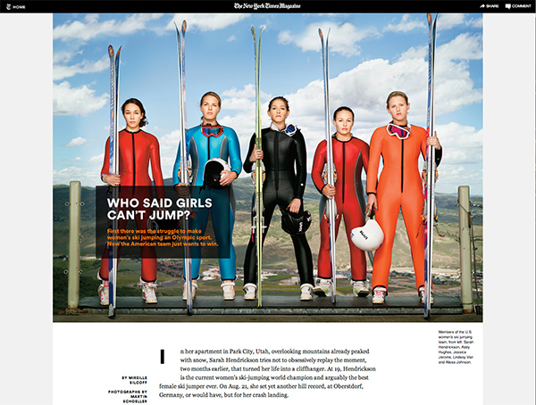
Photo (1280px) by Martin Schoeller
They have made strides with their “Snowfall” layout to infuse more and smarter online design into their pages.
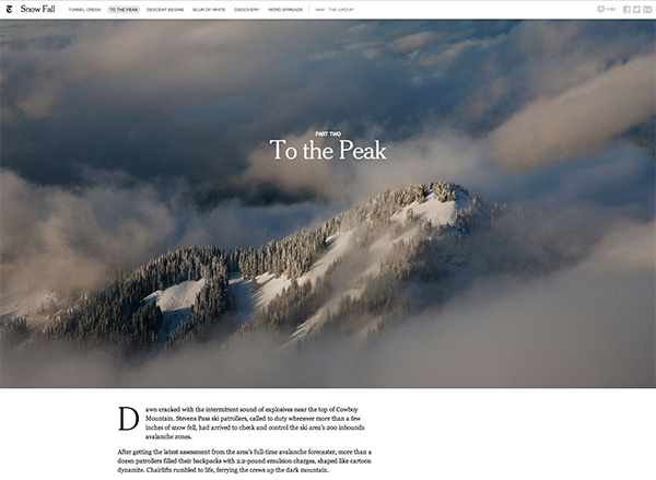
“Snowfall” design with full width images
The Snowfall and Magazine designs aside, I find the New York Post website to be more visually-oriented.
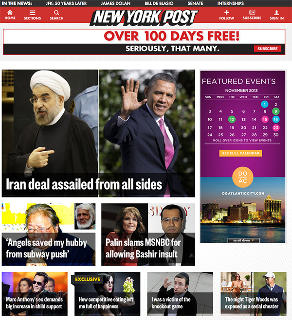
There are no ledes. There are only titles overlaid atop photos — The Post’s photos are often lascivious and/or provocative, but still front and center. And in the inner pages of the site, photography acts as “click bait” for the reader.
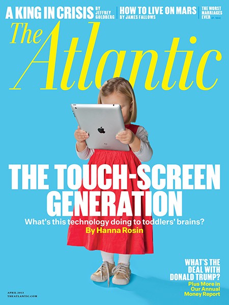
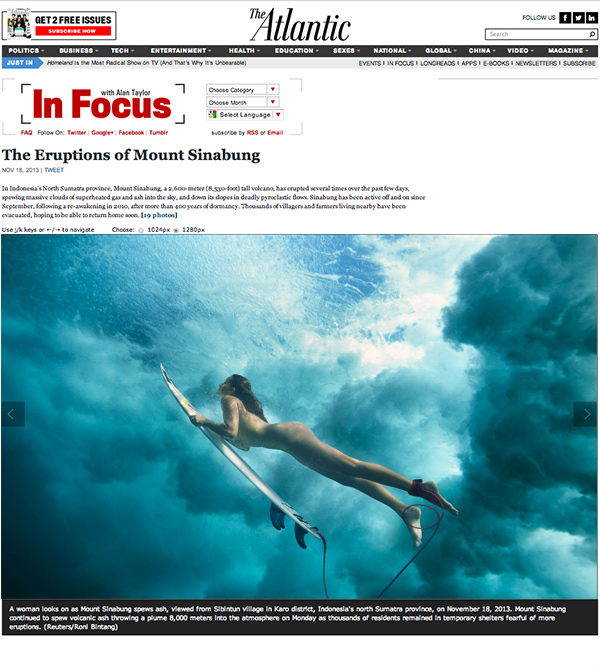
Even though the concept is old by Internet years, The Atlantic, still does a great job of incorporating large images (1280px) in a vertically-scrolling display, rather than relying on the more typical pagination or filmstrip display styles.
In non-news website land, things have gotten noticeably larger. A trend, perhaps influenced by tablet design, is full-screen, full-bleed photos. Consumers are familiar with this from their smartphones, iPads, Flickr, and even our own PhotoShelter Beam websites feature a number of full-screen templates.
A consequence of full-screen design on a multitude of devices with different aspect ratios is unintended cropping of images. Photographers spend a lot of time composing images. They look from edge to edge and are mindful of concepts like the Rule of Thirds, so perhaps the lack of adoption of full-screen design in news websites is a result of wanting to display the image with the photographer’s crop.
A full-screen image conforms to the browser size which can vary by device or user preference.
This concern, my friends, is malarky.
It’s not that I don’t believe in the photographer’s right to compose the image, it’s that images are cropped all the time by photo editors and others in the publishing chain. Horizontals are turned into verticals. Landscapes become squares. Details are zoomed in. The photographer simply does not control how an image will be viewed the moment he/she delivers the file to the editor. And unlike “art” (which exists to ask “what is art?”), I would argue that the goal of photojournalism is to convey a story through the image. If a larger, cropped photo is more effective than a smaller uncropped photo in grabbing the reader’s attention, then mission accomplished. If different crops of the same image still capture the reader’s attention, then mission accomplished.
The cropping issue is similar to the “pan-and-scan” version of movies (aka “This film has been modified from the original to fit your screen”). Purist hate it, and given the choice, I’d pick the letterbox version every time. But not given the choice, I don’t know what I’m missing visually, and the story still comes through even if the DP is rolling over in his/her grave.
The point is that in order to raise the profile of photojournalism, we need to figure out better ways to make photos stand out.
Here is the ESPN Body Issue online.
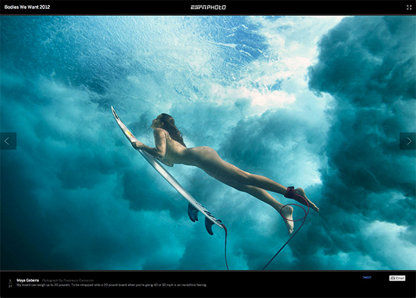
Glorious, right?
Here it is again as envisioned in TheAtlantic layout.
And envisioned in the New York Times layout.
And envisioned in the Sun-Times layout.
Which would you rather look at?
ESPN expends a modicum of effort to prevent drag and drop of the image, but anyone with a hint of technical acumen can get at the large digital image. Apparently, they don’t care. And neither should you. This is the 2nd decade of the 21st century. Worrying about online theft of images is akin to being baited by trolls. Don’t do it.
Which reminds me, this is the 2nd decade of the 21st century. Let’s make sure that our treatment of photography on news websites reflect that fact.
UPDATE: Bravo Sports Illustrated.
You May Also Like
-

Expert Advice and Top Tips from Pro Photographers for 2024
What’s one piece of advice you would give to aspiring or up-and-coming photographers? We asked nine experienced photographers and PhotoShelter members to share their top tips for those looking to get ahead in their photography careers. From finding your own visual voice to working with a mentor or photo assistant, each piece of advice listed […]
-

What’s On Your Photography Holiday Wish List?
The holiday season is around the corner and that means it’s the perfect opportunity to upgrade your gear or find that special gift for the visual storyteller or photography enthusiast in your life. We reached out to a handful of renowned photographers and PhotoShelter members, each with their unique styles and preferences, to bring you […]
-

Share a Photo That Means the World to You
We all have a photo that means the world to us. Maybe it’s one we made ourselves – the first photo from our first camera. It could be an old family photo in a beloved photo album. Or maybe it’s an iconic image that hangs on our wall at home. With World Photography Day coming […]