Share
The Integrity of the Image tl;dr
In response to the increasing ambiguity over acceptable levels of manipulation in photojournalism contests, World Press Photo commissioned a report...
In response to the increasing ambiguity over acceptable levels of manipulation in photojournalism contests, World Press Photo commissioned a report entitled “The Integrity of the Image: Current practices and accepted standards relating to the manipulation of still images in photojournalism and documentary photography.” It’s 20 pages long, so here’s the tl;dr:
- Using the darkroom as an analogy and starting point for the discussion of digital manipulation is outmoded
- There are no concrete, widely accepted guidelines. Interviewees assess images on a case-by-case basis.
- The industry should try to develop a verifiable “digital audit trail.”
Darkrooms as an analogy
This is perhaps the most instructive statement. Even though digital capture is necessarily computational in nature, we still use darkroom analogs in explaining manipulation. Photoshop icons are even skeumorphic in that regards (e.g. dodge and burn). We now do things in Photoshop that are much faster than their darkroom processes (e.g. masking), but we also do things that were impossible (e.g. lens correction, channel mixing, magic wand selection). When photographers and organizations describe acceptable manipulation as “the stuff we did in the darkroom,” they are not accurately accounting for the state of digital photography.
There are no concrete guidelines
The report notes that a number of organizations in the US have published guidelines or code of ethics, but this type of statement rarely exists in the rest of the world. Combined with a generally more liberal attitude towards manipulation in Europe, it’s easy to see how a contest like World Press Photo would have such variance in understanding and acceptability of manipulation.
The industry should develop a digital audit trail
Revision control and centralized repositories are a cornerstone of open-source software, and even consumer cloud software (e.g. Google Docs) provides a history of changes. The process and mechanisms for creating an audit trail are easily understood, but very data intensive insofar as an image history is concerned. Instead, contests should simply rely upon the “original” image and compare it to the final submission. If we agree that there will be no consensus on exact guidelines, then the only way to gauge whether something is within bounds is to use before/after comparisons.
All of this aside, I still refer back to my piece entitled “Why Do Photo Contest Winners Look Like Movie Posters?” and show you the World Press Photo winners in 2003 and 2012.
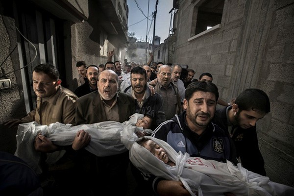
World Press Photo of the Year 2012. Photo by Paul Hansen.
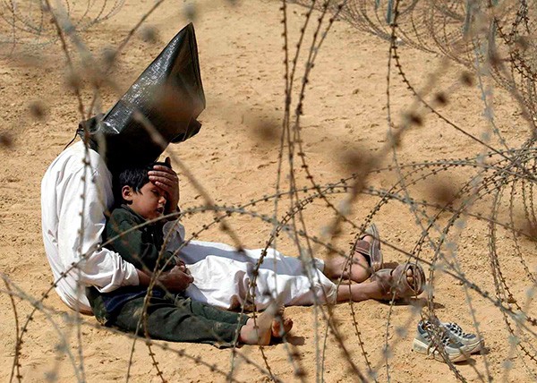
World Press Photo of the Year 2003. Photo by Jean-Marc Bouju
What have we really gained by the overcooking of the more recent image? Is it more accurate? More truthful? The Bouju image is as powerful as the Hansen image, and it doesn’t rely on heavy toning. Both images have incredible composition, overall scene exposure, and capture a peak moment. But with the Hansen image, I feel like I have been visually clickbaited.
Visual tastes may change, but the way the real world looks doesn’t. That to me is the biggest takeaway in the manipulation fracas.
Next Post: 13 Photo Books for Your Stocking Stuffers
Previous Post: The Pyrrhic Victory of “Hands Up, Don’t Shoot” in Photos
You May Also Like
-

Expert Advice and Top Tips from Pro Photographers for 2024
What’s one piece of advice you would give to aspiring or up-and-coming photographers? We asked nine experienced photographers and PhotoShelter members to share their top tips for those looking to get ahead in their photography careers. From finding your own visual voice to working with a mentor or photo assistant, each piece of advice listed […]
-

What’s On Your Photography Holiday Wish List?
The holiday season is around the corner and that means it’s the perfect opportunity to upgrade your gear or find that special gift for the visual storyteller or photography enthusiast in your life. We reached out to a handful of renowned photographers and PhotoShelter members, each with their unique styles and preferences, to bring you […]
-

Share a Photo That Means the World to You
We all have a photo that means the world to us. Maybe it’s one we made ourselves – the first photo from our first camera. It could be an old family photo in a beloved photo album. Or maybe it’s an iconic image that hangs on our wall at home. With World Photography Day coming […]