Share
4 Ways to Elevate Your Photo Website in Minutes (and Forget the Coding)
With every new year comes new opportunities to start fresh. New Year’s resolutions, though, have a habit of coming and going as fast as the New Y...
With every new year comes new opportunities to start fresh. New Year’s resolutions, though, have a habit of coming and going as fast as the New Year itself. Generally, it’s because we bite off more than we can chew and set goals that are time consuming or overwhelming.
So, what’s the solution?
Make it simple.
Build small goals that are easy to accomplish with little to no time — and set yourself up for success going forward. Sound simple? It is. We promise. And we’re here to help.
Welcome to #WorkLessWednesday. For the next few weeks, we’ll help you achieve the goal of making your life a little easier, and it’ll only take you 15 min or less. Here on the blog and on twitter, we’ll share how to simplify your photography workflow and give you practical ways to work less so you can spend more time doing the things that you love (like shooting).
To kick things off, let’s talk websites. It’s 2016, folks, and a subpar website just isn’t going to cut it.
Hopefully you already know that PhotoShelter makes designing your website super simple (More on that here if you need a refresher). In a matter of minutes, you can have an engaging website that’s both user-friendly and beautiful.
We’ll cut to the chase with some examples of easy ways to clean up your layout and design. They’re small things that will make it easier for your clients to find what they’re looking for, including:
- Easy navigation
- A better viewing experience
- The hub for your work online
- A professional look and feel
Take a bite of one or all of these options. It really will just take you 15 minutes!
1. Make Your Navigation Clutter Free – Chrissy Lynn
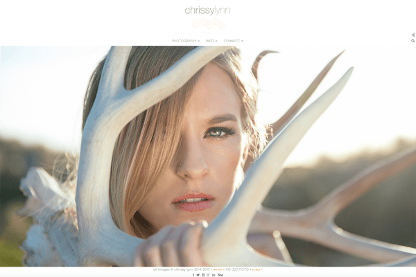
Template: Downtown
Chrissy Lynn, a lifestyle, fashion and portrait photographer, makes great use of drop down menus to keep her website clean and easy for visitors and potential clients to navigate. She gets right to the point with what you need to know with headlines: Photography, Info and Connect. You’ll find all of her portfolios in ‘Photography’, her bio and blog under ‘Info’, and all of her social media sites under ‘Connect’. A messy navigation is a quick way to overwhelm a visitor, so take advantage of using drop-down menus.
To learn more, check out our navigation support page.
2. Present Your Images as They’re Meant to Be Seen – Jonathan Bielaski
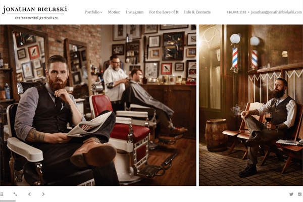
Template: Horizon
Appearance can be everything, so it’s important to understand the best way your images should be viewed. For Jonathan Bielaski, an environmental portrait photographer, many of his images are a part of a larger series and best viewed side-by-side. The Horizon template allows the viewer to easily scroll through to see the story unfold with consistent style and branding throughout.
You can feature as many galleries as you like with the horizon template, and setting up your navigation and custom pages with any of the PhotoShelter templates is quick and painless.
3. Create a One-Stop Shop for your online presence – Espen Rasmussen
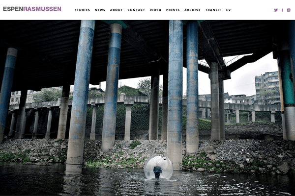
Template: Promenade
Clients shouldn’t have to do a google search to discover who you are (or all the things you have done). Your website should essentially be hub for your online presence — linking to everything you want your clients to find (pro tip: make life easy for your clients, too!).
Photojournalist Espen Rasmussen takes advantage of the ability to seamlessly integrate his video feed, link to other projects he has online, display his social media icons up front and center, and create custom pages to showcase his awards and exhibitions. With PhotoShelter, integrating Vimeo, Instagram, and your blog are as easy and plugging in your handles and clicking ‘save’. You can also create as many custom pages as you need to share other information about your work – things like press hits, tearsheets, favorite equipment, client testimonials, calendar embeds.
Check out these short reads on integrating your social media sites and social follow buttons.
4. Make Your Website Truly Yours – Chris Council & Emily Chaplin
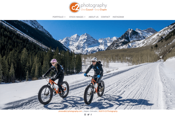
Template: Downtown
Having a personalized brand is key, especially in an industry that’s becoming more saturated by the day. Your brand not only sets you apart from competitors, but it also communicates your level of professionalism and who you are. Commercial and Editorial photographers Chris Council and Emily Chaplin have a unique logo that sets the tone for their work and it also lets us know they’re a team. They have their social following buttons displayed up front and center and their contact page includes buttons for who represents them as well as their social follow buttons — all alongside their wide variety of portfolios and stock imagery. The clean navigation and branding speak to their professionalism and are subtle queues that speak to why a viewer would want to hire them.
Upload your own custom logo, or have one of our certified consultants design one for you.
Happy simplifying!
Questions? Don’t hesitate to get in touch!
Next Post: 11 TED Talks on Photography Worth Watching
Previous Post: Joel Goodman on his NYE “Photo of the Year”
You May Also Like
-

Expert Advice and Top Tips from Pro Photographers for 2024
What’s one piece of advice you would give to aspiring or up-and-coming photographers? We asked nine experienced photographers and PhotoShelter members to share their top tips for those looking to get ahead in their photography careers. From finding your own visual voice to working with a mentor or photo assistant, each piece of advice listed […]
-

What’s On Your Photography Holiday Wish List?
The holiday season is around the corner and that means it’s the perfect opportunity to upgrade your gear or find that special gift for the visual storyteller or photography enthusiast in your life. We reached out to a handful of renowned photographers and PhotoShelter members, each with their unique styles and preferences, to bring you […]
-

Share a Photo That Means the World to You
We all have a photo that means the world to us. Maybe it’s one we made ourselves – the first photo from our first camera. It could be an old family photo in a beloved photo album. Or maybe it’s an iconic image that hangs on our wall at home. With World Photography Day coming […]