Share
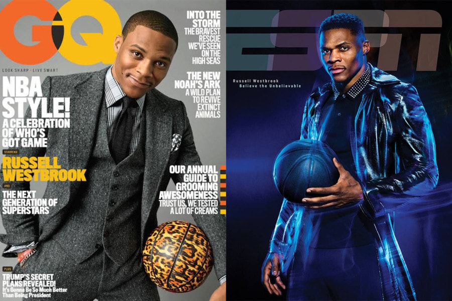
Who Shot It Better? Russell Westbrook: Peggy Sirota or Pari Dukovic
In the somewhat brief history of this column, I’ve fielded some spectacular comments on how “shallow” and “meaningless” it is to compare ...
In the somewhat brief history of this column, I’ve fielded some spectacular comments on how “shallow” and “meaningless” it is to compare “apples and oranges.” Before we get into the triple-double machine known as the NBA’s Russell Westbrook, I thought I would indulge myself in explaining why it’s not meaningless to compare two photos.
First, let me dispense with the obvious, the schtick is meant to be light-hearted. Now that that’s out of the way…Anyone who has ever taken an art class knows that the “crit” (aka the critique) is a crucial feedback mechanism that not only helps the artist, but helps others in the class develop their own style, as well as their critical/criticism skills. Photography is a highly literal medium with a modernist approach. Yet for all it’s literalism, we can end up with two distinctly looking photographs of the same subject. Some of the questions I ask myself include:
- Why did the photographer choose the lighting pattern?
- Why did the photographer choose the focal length of the lens?
- Why was the subject styled in a certain way?
- Why did a photo editor hire this photographer to shoot this subject?
- Why did the photo editor choose this image (presumably from many images in the shoot) for the cover?
- How does graphic design work with or against the image?
- Why do I feel more for one photo than another?
Comparing two magazine covers of the same subject gives us an opportunity to examine these questions. I don’t consider it vacuous or dumb to discuss photography in this way. In fact, I consider it essential to my development as a photographer (albeit a non-professional). If the question was merely answered without an explanation of “why,” then I agree, the exercise is meaningless. But understanding the why can lead to different avenues of exploration and new epiphanies. So in other words, you’re the dumb dumb, not me! Ok, back to the show!
The Oklahoma Thunder’s Russell Westbrook is known for two things: his fashion and his triple doubles. For the uninitiated (and/or disinterested) a triple double in basketball is when a player tallies 10 or more stats in three of the five main statistical categories. Usually, a player does this with points, rebounds, and assists. So far this season, Westbrook has accomplished the feat 33 times – second most in history to Oscar Robinson, and surpassing greats like Wilt Chamberlain, Jason Kidd and Magic Johnson. Westbrook is on track for the league’s MVP award. Give all of these facts, it’s no surprise that he’s showing up on magazine covers.
Here’s the first one. GQ’s Nov 2016 issue shot by Peggy Sirota.
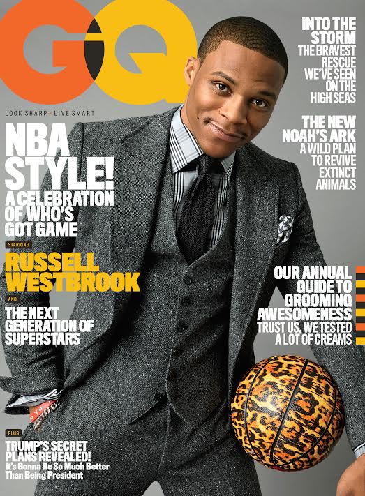
Westbrook loves fashion! And clearly he’s loving wearing a three-piece suit while holding a leopard print basketball. Sirota is not known for complex lighting, and here she employs a single light set-up against gray seamless, and perhaps a bounce card on camera right to fill-in the shadows. Pretty straightforward shot, but Westbrook’s left hand is bothering me in the lower right corner. It looks misshapen! What’s up with that?
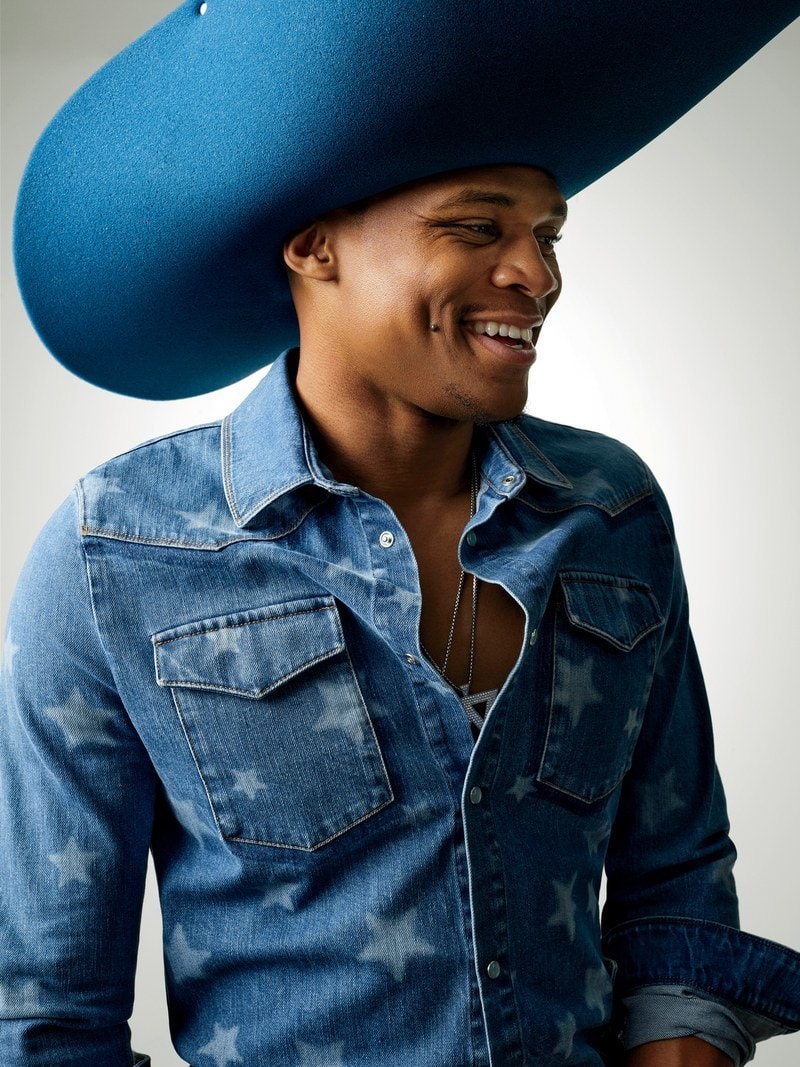
Sirota’s images can be really fun, and often humorous. I love this one with the oversized, foam cowboy hat.
If you ever want to inject a streak of color, you hire Pari Dukovic like ESPN did for their March 27 issue. While not working as the New Yorker’s staff photographer, Dukovic does a fair amount of freelancing because people wanna get some of that! Let’s take a look.
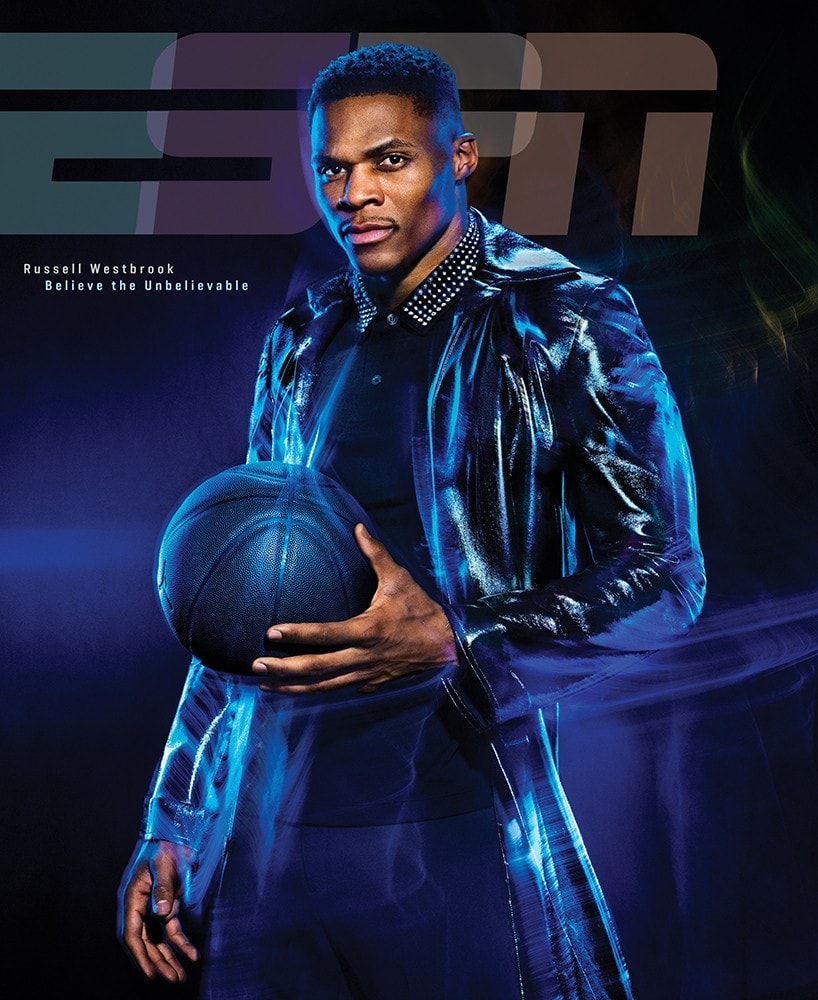
Well, look at that. Blue/purple gels on those kickers, with what looks like a fairly small lighting source for the key. It’s a pretty hard shadow, so definitely not a softbox or standard beauty dish. And what about those streaks of light? Dragging the shutter while the modeling lights are on? Hard to say! What do you think?
This time we have a black basketball, and the caption says “Believe the Unbelievable.” Westbrook is looking like David Copperfield about to make the magic happen!
Verdict: I love Sirota’s editorial work, but the GQ cover is unremarkable. The editors tend to play it really safe with the cover imagery, and it bums me out that there’s always more interesting stuff inside. Dukovic gets the MVP this time!
You May Also Like
-

Expert Advice and Top Tips from Pro Photographers for 2024
What’s one piece of advice you would give to aspiring or up-and-coming photographers? We asked nine experienced photographers and PhotoShelter members to share their top tips for those looking to get ahead in their photography careers. From finding your own visual voice to working with a mentor or photo assistant, each piece of advice listed […]
-

What’s On Your Photography Holiday Wish List?
The holiday season is around the corner and that means it’s the perfect opportunity to upgrade your gear or find that special gift for the visual storyteller or photography enthusiast in your life. We reached out to a handful of renowned photographers and PhotoShelter members, each with their unique styles and preferences, to bring you […]
-

Share a Photo That Means the World to You
We all have a photo that means the world to us. Maybe it’s one we made ourselves – the first photo from our first camera. It could be an old family photo in a beloved photo album. Or maybe it’s an iconic image that hangs on our wall at home. With World Photography Day coming […]