Share
Who Shot It Better? Jennifer Lawrence: Annie Leibovitz or Mario Testino
The highest paid actress in the world, Jennifer Lawrence, is well-known for her portrayal of Katniss Everdeen in the Hunger Games series and Mystiq...
The highest paid actress in the world, Jennifer Lawrence, is well-known for her portrayal of Katniss Everdeen in the Hunger Games series and Mystique in the X-Men movies. But she’s also garnered four Oscar nominations and won a Best Actress award for Silver Linings Playbook. And this month, she becomes the first actress to appear on the cover of Vogue twice to celebrate the magazine’s 125th anniversary.
A perfect time to make a photographic comparison. Vamanos!
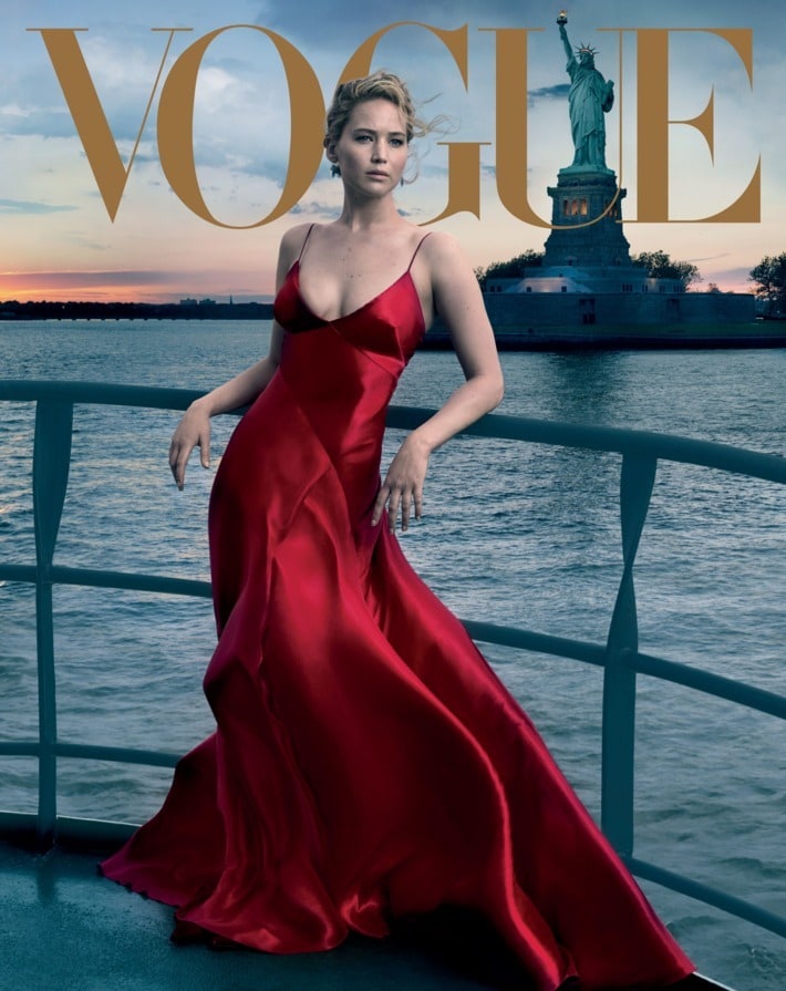
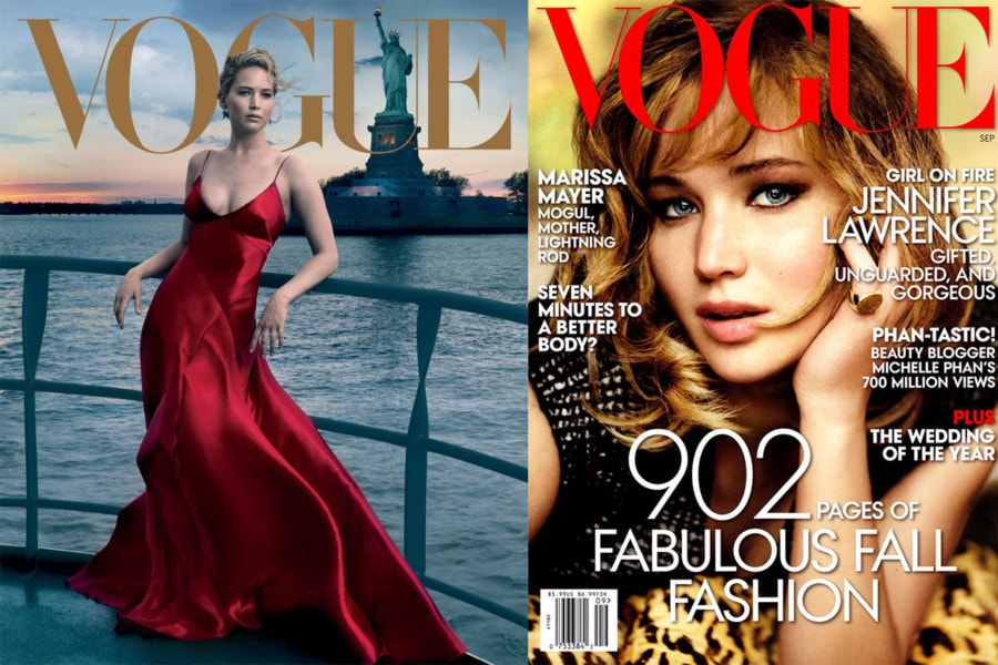
Annie Leibovitz was on a boat with JLaw cruising by the Statue of Liberty at sunset for this shot.
When it comes to Leibovitz’s work, it’s hard to tell what is in-camera and what has been composited. But we can deconstruct this much: There is a very soft keylight camera right. It might even be a strip light given the lack of spill on the railing – but given the evenness of tone, it’s likely to be heavily retouched. There’s no motion blur in the water even though the sun is low in the sky, suggesting a high ISO. The perspective doesn’t look ultra-wide, and since Lady Liberty is in focus, we’re probably stopped down on the aperture. The lights in the base of the statue are balanced with the sunset – I’m not saying it’s impossible, but it seems improbable, so we’re likely seeing the effects of some heavy retouching.
The composition is quite nice, and I like JLaw’s pose and expression. The red satin looks great! We should also point out that this is a very atypical Vogue cover, which is almost always a tight studio shot. But in truth, Leibovitz is often tapped to photograph actresses for Vogue covers, and those shots tend to be environmental.
Let’s compare this to Mario Testino’s cover from 2013.

Whereas Leibovitz is known more as a portraitist, Testino is known more as a fashion photographer, and the cover aesthetic certainly reflects this categorization. There is a very shallow depth-of-field. The reflection in her eyes seem to show a gridded softbox. Her big pupils suggest strobe vs natural light. I love the warm tonality. Her hair and make-up look fantastic.
Verdict: I’m a sucker for a good environmental portrait, so I’m siding with Leibovitz. But the more I analyze the photo, the more I’m turned off by the retouching. How can her right hand be illuminated while the railing has essentially the same luminance on both sides of her? I don’t expect a cover shot to be devoid of retouching, but sometimes I miss the honesty of Leibovitz’s early work.
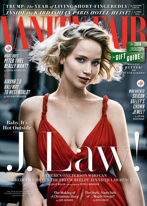
Also, I might like Peter Lindbergh’s Vanity Fair cover better…
You May Also Like
-

Expert Advice and Top Tips from Pro Photographers for 2024
What’s one piece of advice you would give to aspiring or up-and-coming photographers? We asked nine experienced photographers and PhotoShelter members to share their top tips for those looking to get ahead in their photography careers. From finding your own visual voice to working with a mentor or photo assistant, each piece of advice listed […]
-

What’s On Your Photography Holiday Wish List?
The holiday season is around the corner and that means it’s the perfect opportunity to upgrade your gear or find that special gift for the visual storyteller or photography enthusiast in your life. We reached out to a handful of renowned photographers and PhotoShelter members, each with their unique styles and preferences, to bring you […]
-

Share a Photo That Means the World to You
We all have a photo that means the world to us. Maybe it’s one we made ourselves – the first photo from our first camera. It could be an old family photo in a beloved photo album. Or maybe it’s an iconic image that hangs on our wall at home. With World Photography Day coming […]