Share
Assessing the State of Photojournalism via the NYT’s Year in Pictures
The end of the year brings about the annual deluge of “Pictures of the Year” packages. Teams of picture editors scour through thousands of phot...

The end of the year brings about the annual deluge of “Pictures of the Year” packages. Teams of picture editors scour through thousands of photos to assemble jumbo-sized galleries filled with images that are supposedly representative – or at least eye-catching – of the past 12 months.
Since 2001, The New York Times has been publishing its annual “Year in Pictures,” and as the paper of record for many, it acts as a proxy for much of what’s happening in the mainstream media.
Each image and the galleries as a whole can be viewed for content and historical context. But for this exercise, we’ll look at the look-and-feel of the images to see how aesthetics, taste and technology have shifted what photojournalism looks like to the consumer.
The Year in Pictures 2008
We step back a decade to provide a visual comparison. Here are some high-level trends:
Aggressive JPG settings combined with older technology give all the images a patina of blurriness compared to the full-screen, hypersharp images of today. Publishers still concern themselves with webpage load times, but technological improvements from internet speeds to better file compression to CDNs (content delivery networks) mean that images can be displayed at higher quality with larger dimensions. Richard Perry’s storm cloud image lacks detail in the texture of the grass even though the tonality and dynamic range are decent.
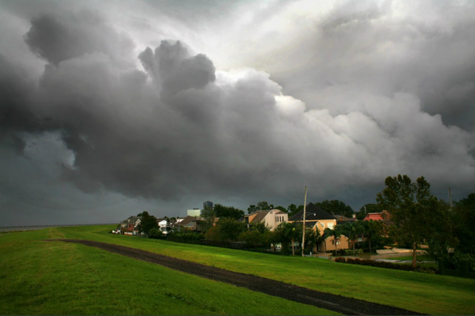
Photo by Richard Perry/The New York Times
White balance aggressively favor warm skin tones. In Stephen Crowley’s photo of Senator John McCain, it’s very possible that the videographer placed a 1/4 CTO to warm skin tones on a dreary day. But this orangey white balance appears in many other photos.
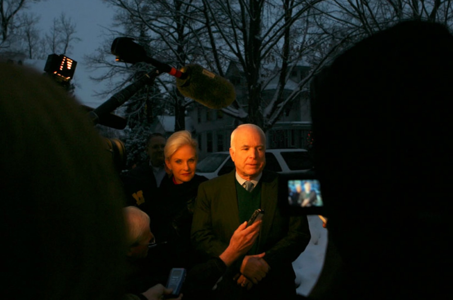
Photo by Stephen Crowley/The New York Times
Digital noise is very apparent in high ISO images. 10 years ago, DSLRs couldn’t be pushed much past ISO 3200, and in that range the images were incredibly noisy like Eric Thayer’s photo from shuttle Endeavor launch. Today, it’s common to shoot at ISO 25,000 in low light, and cameras like the Nikon D5 have native ISO ranges up to 102,400.
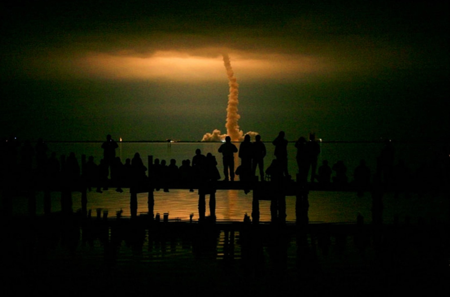
Photo by Eric Thayer/Reuters
Tight shots feature quirky composition. Generally speaking, the composition of images hasn’t shifted much in the past 10 years. But the Times was definitely publishing images with strange crops like Stephen Crowley’s image of John McCain and Sarah Palin. I’m not convinced this image would run any more.
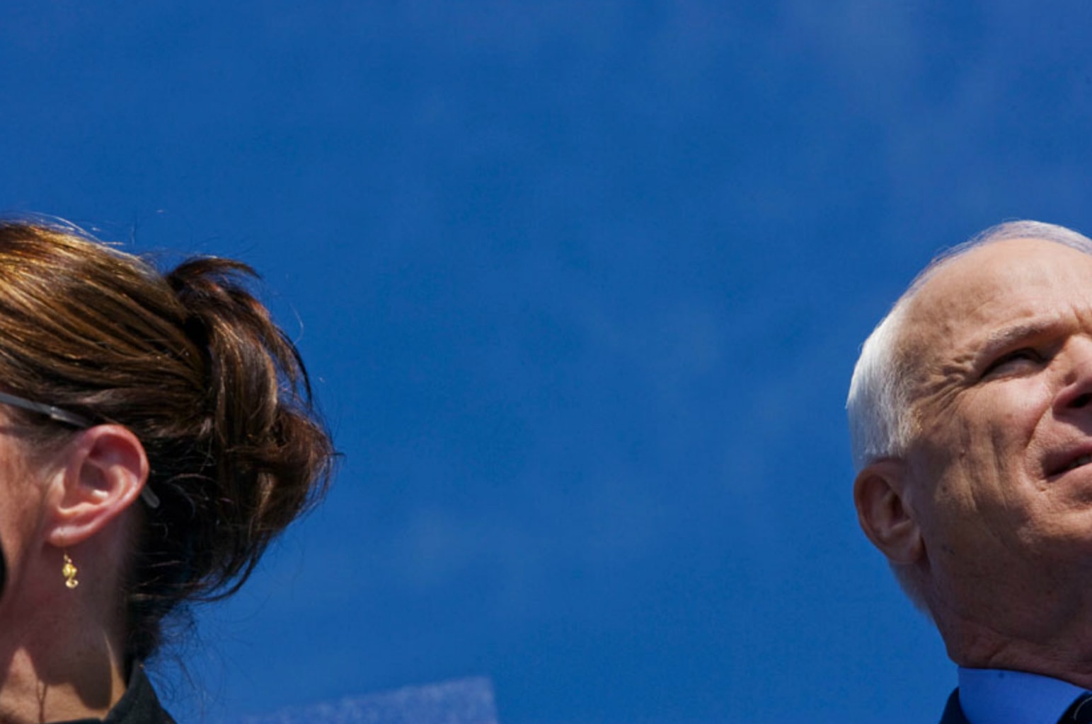
Photo by Stephen Crowley/The New York Times
There is an evenness in the style of toning across almost all images, regardless of photographer. And that style can best be described as “natural” in appearance. Color and contrast appear muted by today’s standards.
Many spot news images feature blur – photographers couldn’t (or were unwilling) to push their ISOs to a level where they could completely freeze motion. Finbarr O’Reilly’s photo of Congolese soldiers shows motion blur in the rifle, hands and face of the main subjects.
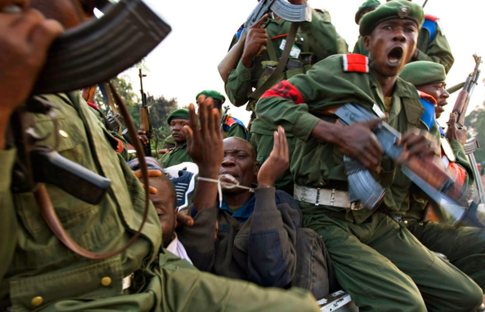
Photo by Finbarr O’Reilly/Reuters
The Year in Pictures 2017
In the past few years, the Times has moved away from thematic categories, instead opting for a month-by-month breakdown. This year is no exception.
Photos are high contrast and punchy. The high dynamic range of the current camera sensors allow photographers to pull a ton of shadow detail and use options like “clarity” (a midtone-only contrast) yielding photos that have a “hyperreal” feel. Meredith Kohut’s image of protestors in Caracas is a perfect example of this style of image making.
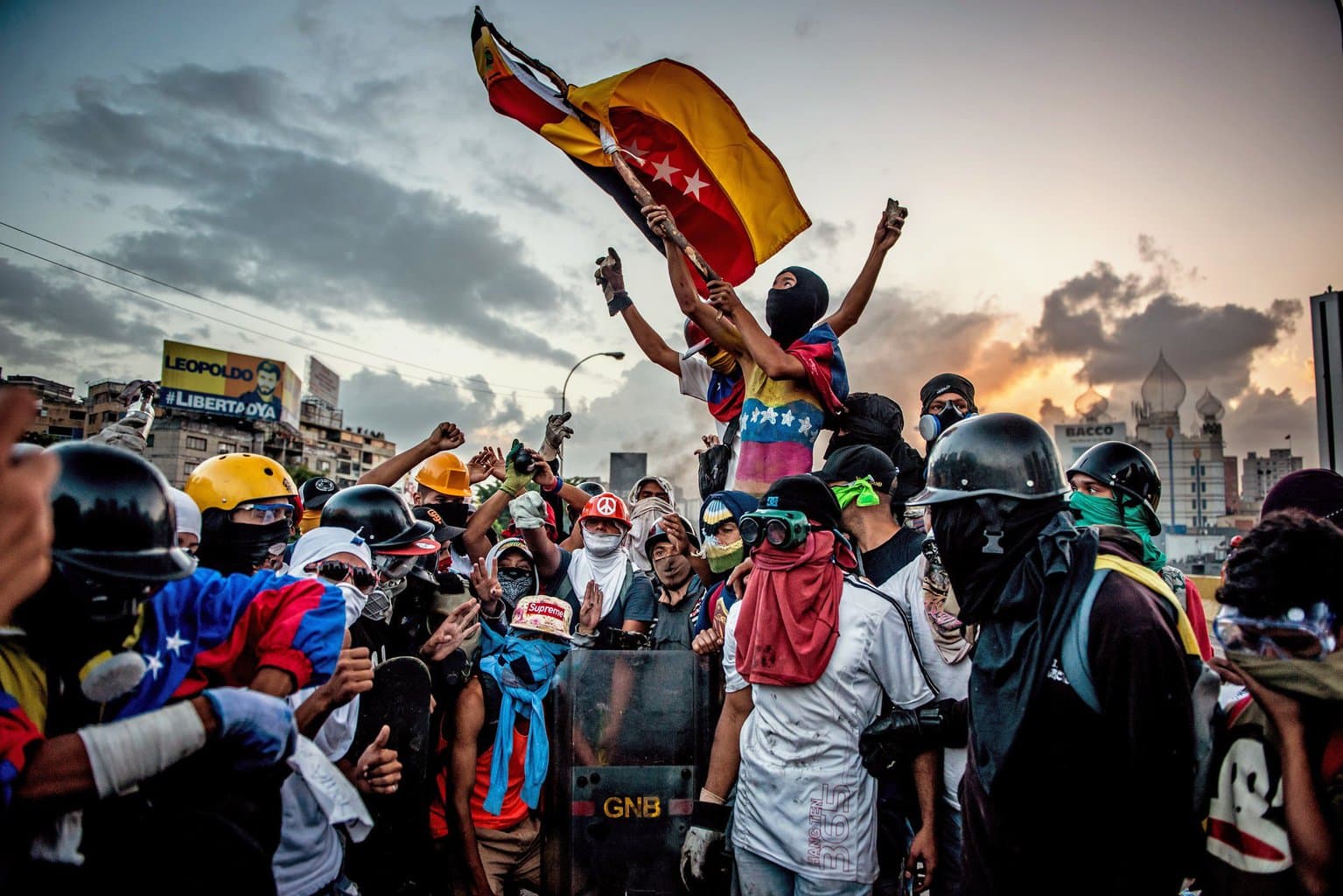
Photo by Meredith Kohut for The New York Times
High ISO helps to produce photos that couldn’t be made even a few years ago. Tyler Hicks’ image from South Sudan looks to be taken well into twilight with the moon hovering in the sky. Noise is very low, and the figures appear sharp – suggesting both a smaller aperture and faster shutter speed.
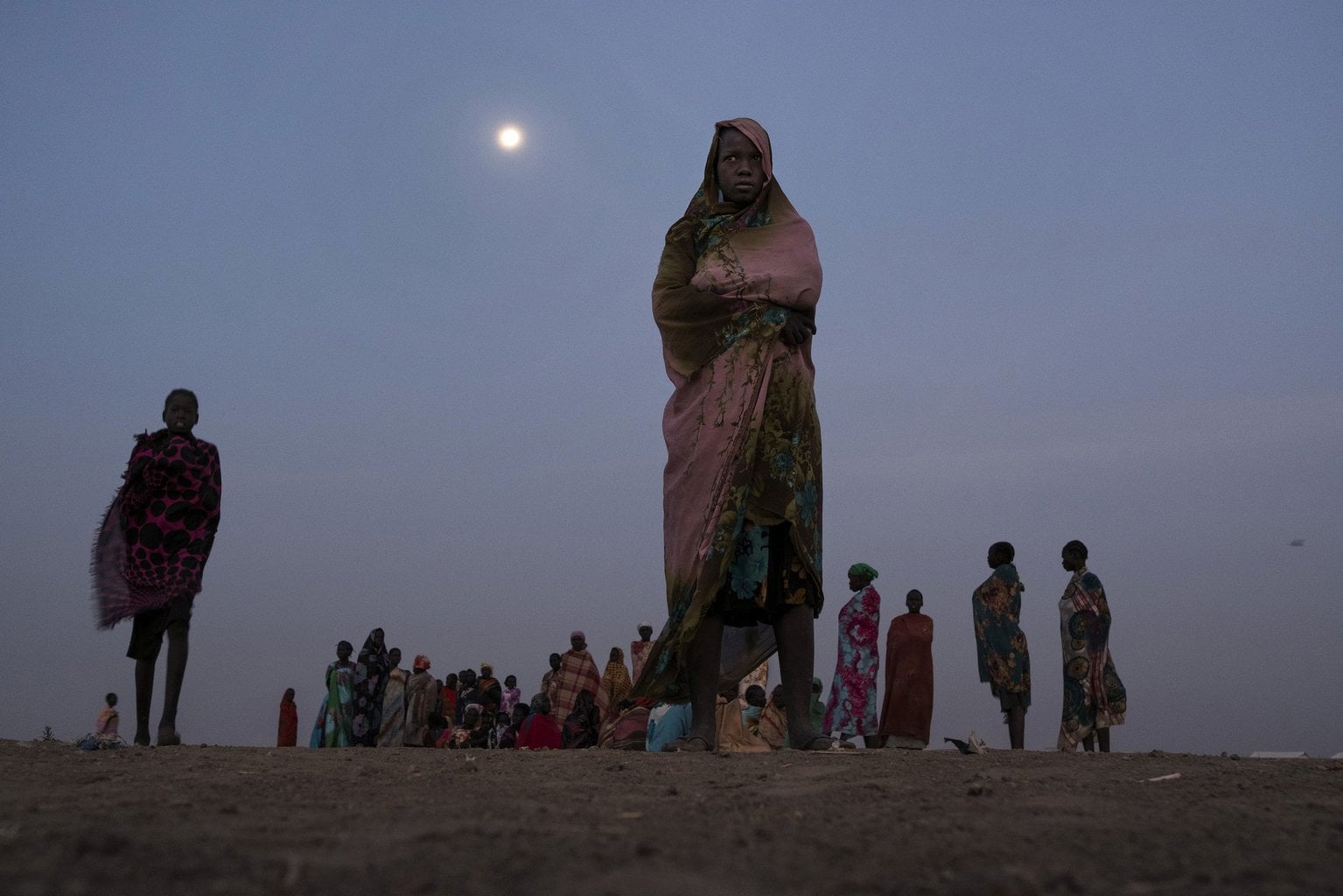
Photo by Tyler Hicks/The New York Times
Spot news is still incredible. There’s no substitute for being there, but being there as an experienced photographer with professional gear creates amazing output. Ryan M. Kelly’s image from the Charlottesville protest is the perfect example of all these elements coming together into one of the most amazing news images of the year – and on his last day of the job to boot.
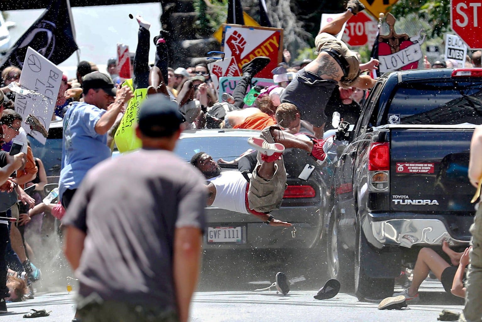
Photo by Ryan M. Kelly/The Daily Progress via AP
White balance is used artistically. Joakim Eskildsen’s image from Estonia was, in many ways, the most surprising image of the set. In 2008, we noted how white balanced seemed to favor warm skin tones and blue skies. Eskildsen’s image goes in the opposite direction with a very yellow palette and a white balance that moves the green foliage into a bluish spectrum. It is a lovely image, but does the post processing move it out of the realm of photojournalism?
Photo by Joakim Eskildsen for The New York Times
Drones are becoming a common tool. Birdseye images from 2008 still appear on an oblique angle – as if the photographer was standing on a tall building or hillside. The proliferation of inexpensive drones makes it practical (FAA regulations aside) for photojournalists to include them in their kit. Josh Haner’s image of a mobile home park destroyed by the Santa Rosa wildfire seems more like a satellite image than something a newspaper photographer might have produced.
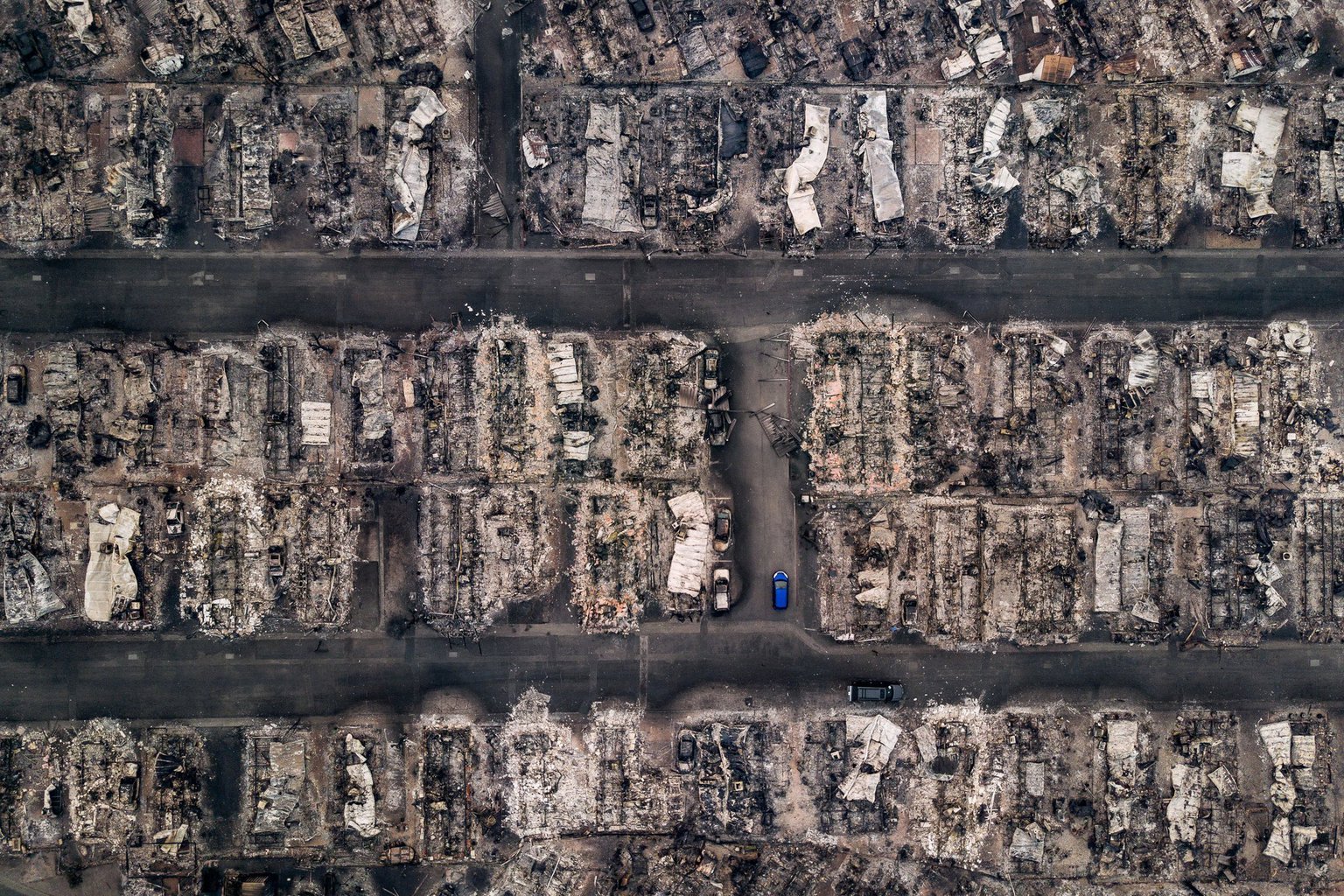
Josh Haner/The New York Times
It’s worth taking a few minutes to go through the entirety of both galleries. The shift in visual style is palpable, but not surprising. Across much of the media landscape, we’ve seen shifts in how information is presented to the consumer (e.g. compare a radio broadcast from 10 years ago to a Radiolab podcast, or a CBS Evening News segment compared to an AJ+ segment). The Information Age means that competition between media outlets is fierce, and publishers like the Times are constantly evolving the way they present information to catch the attention of the viewer. Pictures are no exception, and the current style of “punchy” images that seemingly pop off the screen is inline with Instagram aesthetic, and also a partial reflection of how content is consumed on the small screens of mobile devices.
Previous Post: Our Most Popular Posts of 2017
You May Also Like
-

Expert Advice and Top Tips from Pro Photographers for 2024
What’s one piece of advice you would give to aspiring or up-and-coming photographers? We asked nine experienced photographers and PhotoShelter members to share their top tips for those looking to get ahead in their photography careers. From finding your own visual voice to working with a mentor or photo assistant, each piece of advice listed […]
-

What’s On Your Photography Holiday Wish List?
The holiday season is around the corner and that means it’s the perfect opportunity to upgrade your gear or find that special gift for the visual storyteller or photography enthusiast in your life. We reached out to a handful of renowned photographers and PhotoShelter members, each with their unique styles and preferences, to bring you […]
-

Share a Photo That Means the World to You
We all have a photo that means the world to us. Maybe it’s one we made ourselves – the first photo from our first camera. It could be an old family photo in a beloved photo album. Or maybe it’s an iconic image that hangs on our wall at home. With World Photography Day coming […]