Share
Who Shot It Better? Wo(Men) in Black: Mick Rock or Michal Pudelka
Subjects photographed wearing black against a black background creates a unique “floating head” look. Properly executed, the technique can help...
Subjects photographed wearing black against a black background creates a unique “floating head” look. Properly executed, the technique can help draw the eye to the face without any other distraction. But how does it work when you’re dealing with multiple subjects? Let’s find out!

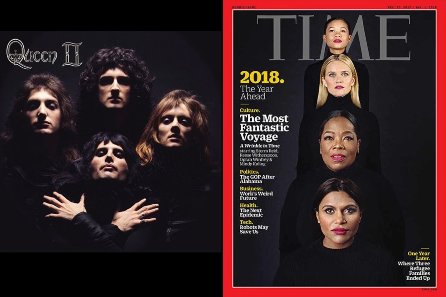
Mick Rock’s classic Queen II album cover is not only iconic, it was recreated for the Bohemian Rhapsody music video.
Reproductions of the image often have the heads against solid black, but the original image actually shows a bit of texture in the shadows ranging from the dark grey background to some detail in the leather jackets. The overhead lighting casts deep shadows in the eye sockets creating a sinister look, but the light does double duty in helping to pull out some luscious texture in the band’s hair. The diamond shaped arrangement is accented by Freddie’s hands, which really help to make the image distinct.
According to an article on VH1, Rock took inspiration from a Marlene Dietrich image from the 1932 movie Shanghai Express.
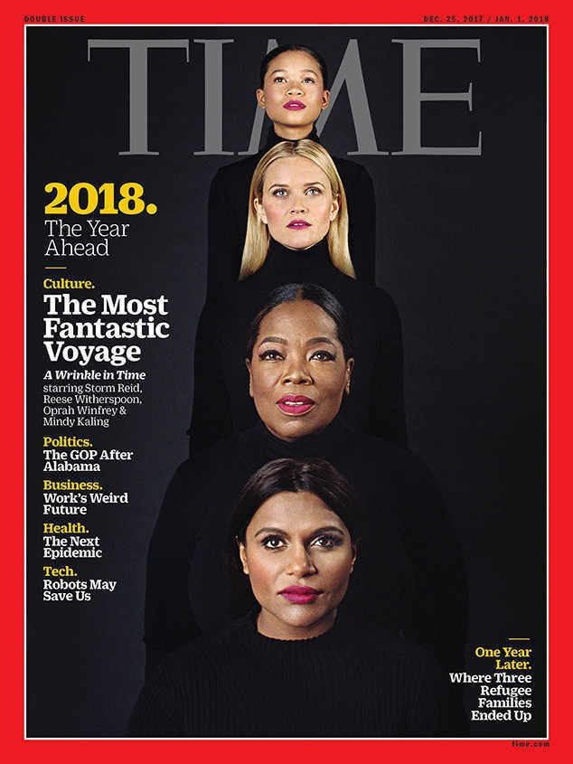
For the some pre-launch chatter about Madeline L’Engle’s A Wrinkle in Time movie, TIME magazine tapped Slovakian photographer Michal Pudelka for the cover honors.
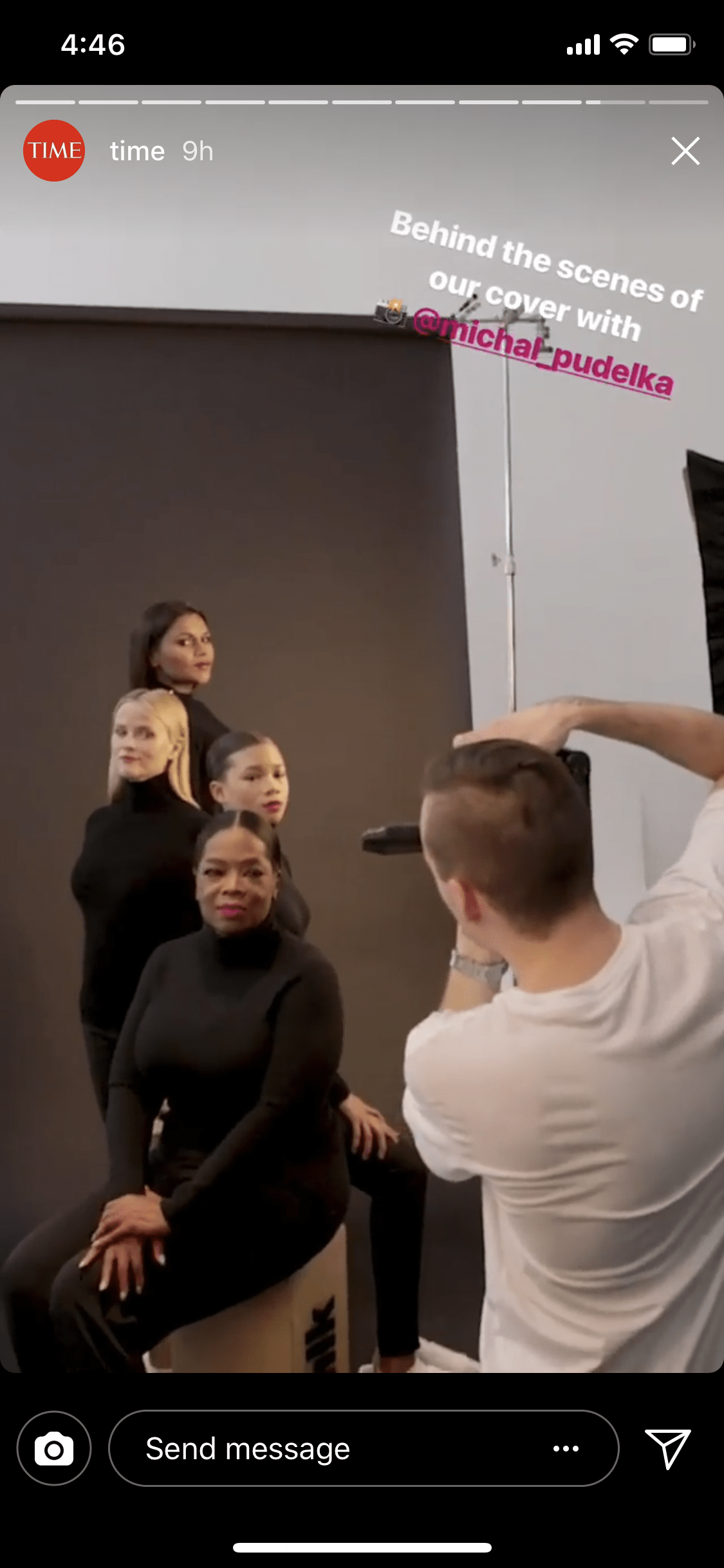
TIME’s Instagram feed had some cool BTS footage of Pudelka in action with actors Reese Witherspoon, Mindy Kaling, Storm Reid and Oprah!
The setup looks like strip lights on both sides of the camera. The left side of Kaling’s face does appear a bit darker which creates a bit more sculpting of her face. In looking at some of the other images from the shoot, it seems like the light on camera right wasn’t positioned to really illuminate the face of the bottom subject. Given the proximal distortion of the closest subject, this was probably a wise choice.
In contrast to Rock’s diamond pattern, Kudelka uses a Christmas tree arrangement to stack the faces.
Verdict: Rock. I find Kudelka’s choice of lens to be a bit puzzling. Instead of using a longer lens to compress the faces, he chose to shoot a little wider rendering the farthest face as noticeably smaller. This is why I referred to the arrangement as a Christmas tree rather than a totem pole. To my eyes, the distortion is a bit too extreme even though I think his lighting is lovely.
You May Also Like
-

Expert Advice and Top Tips from Pro Photographers for 2024
What’s one piece of advice you would give to aspiring or up-and-coming photographers? We asked nine experienced photographers and PhotoShelter members to share their top tips for those looking to get ahead in their photography careers. From finding your own visual voice to working with a mentor or photo assistant, each piece of advice listed […]
-

What’s On Your Photography Holiday Wish List?
The holiday season is around the corner and that means it’s the perfect opportunity to upgrade your gear or find that special gift for the visual storyteller or photography enthusiast in your life. We reached out to a handful of renowned photographers and PhotoShelter members, each with their unique styles and preferences, to bring you […]
-

Share a Photo That Means the World to You
We all have a photo that means the world to us. Maybe it’s one we made ourselves – the first photo from our first camera. It could be an old family photo in a beloved photo album. Or maybe it’s an iconic image that hangs on our wall at home. With World Photography Day coming […]