Share
Who Shot It Better? Jon Bernthal: Beau Grealy or Himself?
Over the past decade, magazine publishers have been experimenting with subscriber-only covers. These covers use different photography and typically...
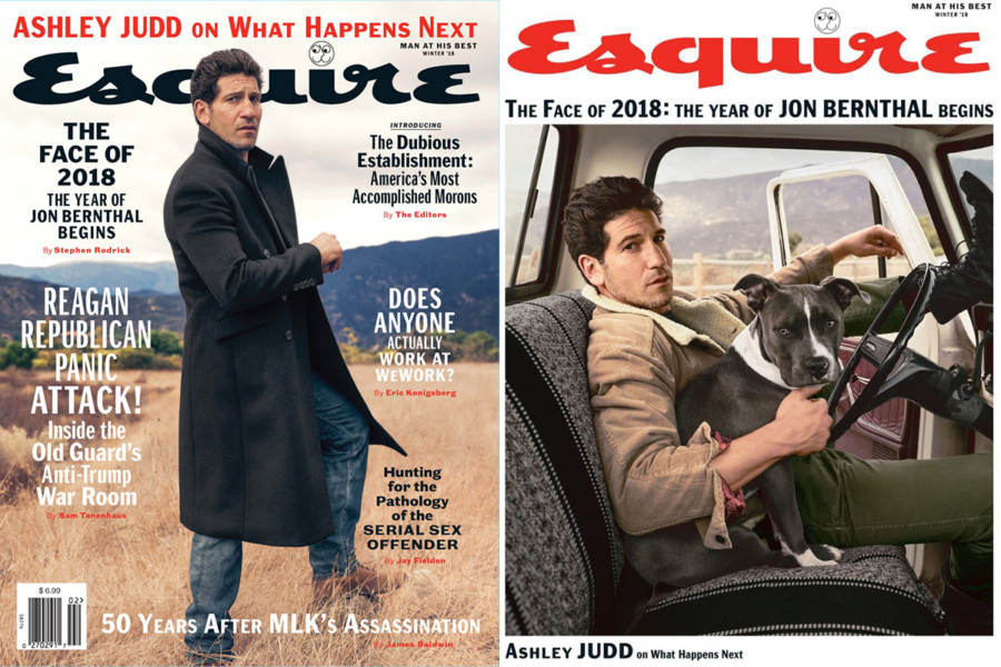
Over the past decade, magazine publishers have been experimenting with subscriber-only covers. These covers use different photography and typically rely on less crowded design and typography to give the cover an air of exclusiveness and collectability. New York-based Beau Grealy photographed the cover feature on actor Jon Bernthal – best known for his work in The Walking Dead and as the star of the new “The Punisher” series on Netflix. Let’s compare his work to himself!
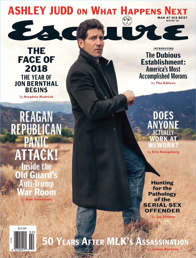
Jon Bernthal Esquire Winter 2018 Newsstand Cover. Photo by Beau Grealy.
The newsstand cover features an upright Bernthal which provides a lot of negative space to drop in copy. With no apparent catchlight in the eyes and what appears to be overcast skies, the image seems to be all natural light – although arguably, the dark coat would be a good candidate for a very subtle fill light or large reflector.
When new lenses are announced, it’s common to see internet commenters talk about the bokeh of a lens and use razor thin depth-of-field to illustrate the “creaminess” of a lens. But this shot is indicative of most editorial and commercial imagery in the real world, which features a tack sharp subject but still discernible backgrounds. After all, what’s the point of an environmental portrait if you can’t make out the environment?
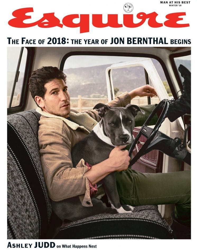
Jon Bernthal Esqure Winter 2018 Subscriber Cover. Photo by Beau Grealy.
Last year, the designers started playing with a solid background field at the top of the subscriber covers (in this case it’s white, but in other examples, they use bold colors). The design choice has a retro look, and also alleviates the need to use an extremely vertical image. And look at this image!
But more intimate and relatable image. Of course, the inclusion of the dog gets an automatic “awwww.” There is a small catch light in Bernthal’s eyes, which isn’t surprising given that Bernthal is sitting inside a truck cab. But the light is motivated – i.e. it’s mimicking the natural light sources so we’re still getting shadowed areas on the left side of Bernthal’s face close to his nose, but still have highlights on the far left. Grealy opens up the shadow areas in the jeans and the dog’s dark fur.
Verdict: Subscriber cover FTW! I find the photo to be much more compelling and of course, I like the fact that the image isn’t littered with type. Although photos can appear by themselves (e.g. in a gallery), photography is often used in conjunction with type or a story, so we need to consider the photo in context. The subscriber image couldn’t have been used on the newsstand cover without including more ceiling and seat, or relying on a strange crop.
Previous Post: More Celebrities Who Are Serious About Photography
You May Also Like
-

Expert Advice and Top Tips from Pro Photographers for 2024
What’s one piece of advice you would give to aspiring or up-and-coming photographers? We asked nine experienced photographers and PhotoShelter members to share their top tips for those looking to get ahead in their photography careers. From finding your own visual voice to working with a mentor or photo assistant, each piece of advice listed […]
-

What’s On Your Photography Holiday Wish List?
The holiday season is around the corner and that means it’s the perfect opportunity to upgrade your gear or find that special gift for the visual storyteller or photography enthusiast in your life. We reached out to a handful of renowned photographers and PhotoShelter members, each with their unique styles and preferences, to bring you […]
-

Share a Photo That Means the World to You
We all have a photo that means the world to us. Maybe it’s one we made ourselves – the first photo from our first camera. It could be an old family photo in a beloved photo album. Or maybe it’s an iconic image that hangs on our wall at home. With World Photography Day coming […]