Share
Who Shot It Better? Christy Turlington: Norman Jean Roy or Pamela Hanson
As the movement to portray models without excessive retouching (here, here) continues to gain momentum, magazines are faced with the same quandry: ...
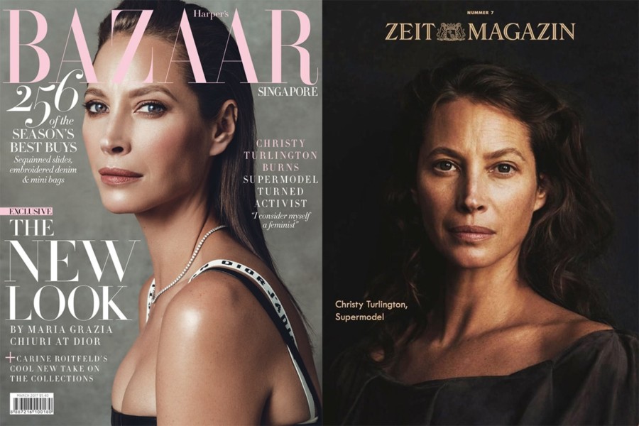
As the movement to portray models without excessive retouching (here, here) continues to gain momentum, magazines are faced with the same quandry: To Photoshop or not? When you’re dealing with a supermodel like Christy Turlington, the issue is arguably more difficult. Turlington rose to fame in the late 80s with her work with Calvin Klein and became a part of the “Trinity” in the 90s along with Naomi Campbell and Linda Evangelista.
Despite her work as an entrepreneur and activist, Turlington is still known to most people as a model. But she is also 49 years old, and the way magazines (and her PR people) choose to portray her likeness says a lot about the age we live in. Let’s take a look at two covers from the past year.
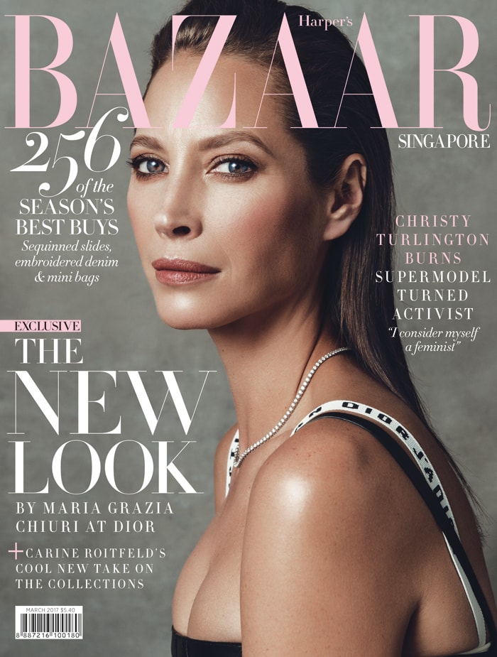
Norman Jean Roy image of Turlington was used for a number of editions of Bazaar magazine. The light source looks rectangular – perhaps a large softbox – positioned at a fairly steep angle off the camera axis. The light position has a nice sculpting effect to Turlington’s face and torso. The image is not over-retouched, and we can see faint crows feet around her eyes and smile lines around her mouth. But the even skin tone on Turlington’s face, shoulders and chest suggest more than just a good make-up stylist.
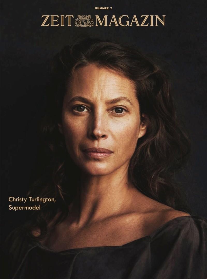
Contrast Roy’s image to the cover of Zeit magazine shot by Pamela Hanson. Although Roy’s image is by no means “high key” it certainly accentuates brighter tones. Hanson’s image, by contrast, is all about shadow. The Rembrandt-style lighting provides dimensionality, but I’m much more interested in the natural appearance of skin tone. There’s obviously less make-up, but the retouching is also done to not obliterate skin imperfections – arguably, the shadow detail is bumped up in contrast to show age and sun damage.
Because of the imperfection, it’s a startling image of a still beautiful woman.
Verdict: Roy’s image feels very conventional compared to Hanson’s. Of course, the intent of each cover is different, but even in isolation, I find Hanson’s image to be more compelling for what it says about our portrayal of age and beauty in 2018.
Next Post: 17 Best Podcasts for Photographers
Previous Post: The List – Adventure Photography Edition
You May Also Like
-

Expert Advice and Top Tips from Pro Photographers for 2024
What’s one piece of advice you would give to aspiring or up-and-coming photographers? We asked nine experienced photographers and PhotoShelter members to share their top tips for those looking to get ahead in their photography careers. From finding your own visual voice to working with a mentor or photo assistant, each piece of advice listed […]
-

What’s On Your Photography Holiday Wish List?
The holiday season is around the corner and that means it’s the perfect opportunity to upgrade your gear or find that special gift for the visual storyteller or photography enthusiast in your life. We reached out to a handful of renowned photographers and PhotoShelter members, each with their unique styles and preferences, to bring you […]
-

Share a Photo That Means the World to You
We all have a photo that means the world to us. Maybe it’s one we made ourselves – the first photo from our first camera. It could be an old family photo in a beloved photo album. Or maybe it’s an iconic image that hangs on our wall at home. With World Photography Day coming […]